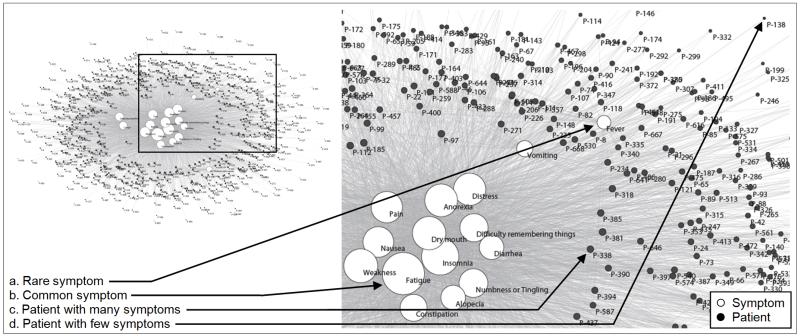
Figure 2.
A patient-symptom bipartite network in the top left (where edges represent symptom severity at any level) visually shows the high overlap of 18 symptoms (white nodes) across 665 patients (black nodes). This high overlap results in a large cluster of symptoms in the center of the network, and a few symptoms that are off center (shown in more detail in the inset). The size of the nodes is proportional to the edges that connect to them. Therefore common symptoms have large nodes, whereas rare symptoms have smaller nodes. The patients that have many symptoms are closer to the center and closer to their symptoms. The above layout was automatically generated by the Fruchterman Reingold algorithm [30]. Please see supplementary figure S1 for the same network where the patient nodes are colored by each patient’s type of cancer revealing that there exists no clustering of patients based on cancer type.

