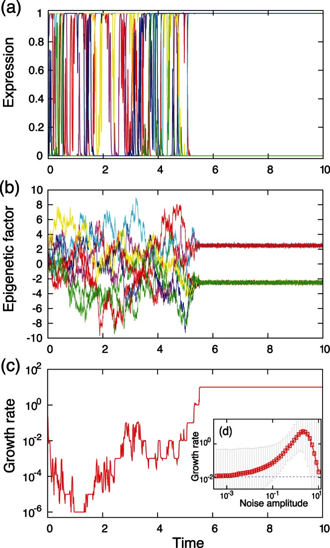
Figure 1. An example of adaptation process with EFR.

(a) Time series of expression levels  . Eight of the 40 gene expression levels are displayed.(b) Time series of the epigenetic factors
  that correspond to the expression levels displayed in (a). (c) Change in the growth rate
  . (d) (inset of (c))The relationship between the noise amplitude
  and the growth rate
  . The geometric mean of the growth rates attained by randomly generated regulatory networks and initial conditions is plotted as a function of the noise amplitude
  . The error bars represent the geometric standard deviation. The blue dotted line indicates the growth rate in the case of a random selection of the state, where the expression level
  takes the values 0 and 1 with equal probability. The growth rate was significantly higher than the random expression pattern, for example
  when
when  (the number of data was 10000; determined by U-test). The parameter values used here are
  ,
,  ,
,  ,
,  ,
,  ,
,  ,
,  , and
, and  . The target expression patterns
  used in the growth rate calculation were determined randomly. Unless otherwise mentioned, these values were used throughout all the figures. The presented results were independent of specific model parameters, and were observed in a wide range of parameter values. We selected above parameter values to present general features of this model.
