
Figure 2. Adult human neck BAT lineage tracing.
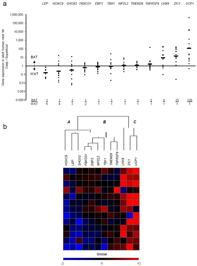
(a) Shown for 13 individuals undergoing routine neck surgery is the ratio of the gene expression found in the deep tissue expressing the highest level of UCP1 (“BAT”) vs. that found in each individual’s SQ fat (“WAT”) for each of the 12 lineage markers. Each closed circle represents a single person. The geometric mean for each gene is represented by the horizontal bars and is also shown at the bottom of the graph as the BAT/ WAT ratio. (b) For the cluster analysis, each color in the figure represents the log10 ratio of the (BAT gene expression) / (WAT gene expression) of a particular gene in each volunteer. Each column contains data from a specific gene, and each row contains data from a single person. Red squares represent high ratios and blue squares represent low ratios. The values in the heat map range between −2 and +2 (i.e. expression ratios between 100-fold in one direction to 100-fold in the other). For visualization purposes, values outside of that range are replaced by either −2 or +2, as appropriate. The dendrogram reflects the degree of correlation of the genes assessed by the hierarchical clustering. Letters “A,”, “B,” and “C” represent the groupings of markers that were, respectively, down-regulated in deeper depots (SHOX2, LEP, HOXC9); not changed (TNFRSF9, TMEM26, TBX1, MPZL2, EBF3, FBXO31); and up-regulated (UCP1, ZIC1, LHX8).