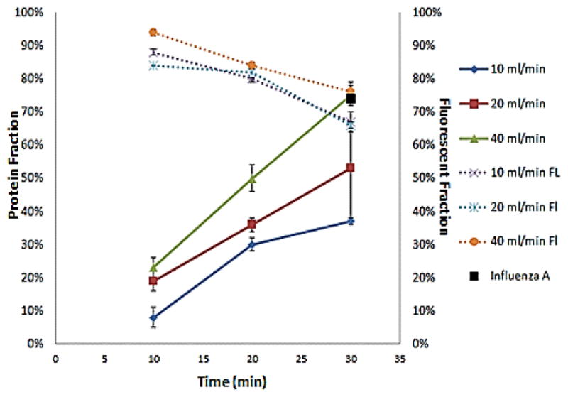
Figure 3.

The graph shows the percentage of protein extracted from the sample (left y-axis) and the recovery percentage of fluorescent beads (right y-axis) as a function of the duration of the experiment (10 minutes, 20 minutes, and 30 minutes). Each line represents a different flow rate of the dialysate (10 ml/min, 20 ml/min, and 40 ml/min). The black point represents the experiment with influenza A.
