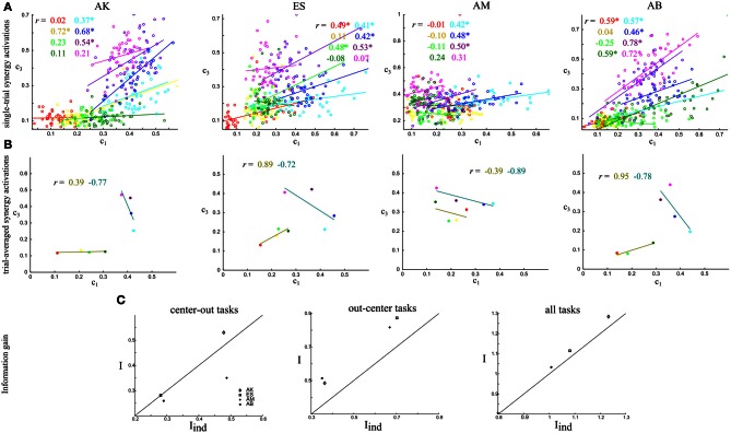
Figure 4.
Quantifying noise and signal correlations between the activations of synergies S1–S3, and assessing their impact on information about the task. (A) Scatterplots of the integral of the single-trial activations of synergies S1–S3 across the eight tasks performed. Each one of the four panels corresponds to the data of one subject. Different colors indicate different tasks and the straight lines are the best-fit lines for the distribution of points for each task. The r values report correlation coefficients and the * denotes statistical significance at p < 0.05. (B) Scatterplots of the task-averaged activations of synergies S1–S3. The two straight lines are the best-fit lines for the distribution of points for the center-out and out-center tasks respectively. Conventions are the same as in (A). (C) Comparison of the information carried by the activations of synergies S1–S3 when taking into account correlations (I) and when ignoring them (Iind). The scatterplots show I vs. Iind across subjects. We plot the 45°-slope line for comparison purposes. Left: Comparison of information about the center-out tasks. Middle: Comparison of information about the out-center tasks. Right: Comparison of information about all tasks.

