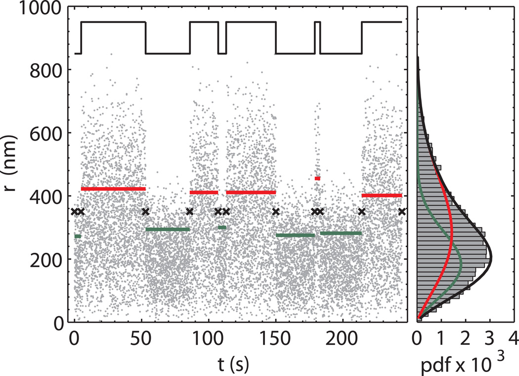
Figure 5.
Expectation-maximization clustering.
Left panel. After the change points have been determined (black crosses), the regions between two adjacent change points are clustered into two groups through the maximization of the total log-likelihood function for a Weibull pdf. The green and red lines represent the average of the data points in the corresponding change point region. The color identifies the DNA conformation corresponding to the two groups (red-unlooped and green looped). The “true” trace (black line) is also reported shifted and scaled for comparison. Right panel. Histogram of the time trace and results of the expectation-maximization step. The red and green curves refer to the retrieved Weibull pdf for the unlooped and looped state, respectively. The sum of the two probability density functions (black line) shows an excellent agreement with the data histogram.

