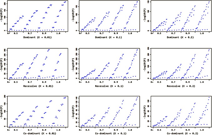
Figure 5. –log10(P) distribution of nine disease models from the simulation results.
Graphs from the top row to the bottom row represent the dominant, recessive and codominant models respectively, and from left to right represent the results with three different K values (0.01, 0.1 and 0.2). Each blue dot corresponds to a –log10(p-value) under that specific setting. Every graph is broken down into four bins with R = 0.5, 0.7, 0.9 and 1.0. Within each bin, the –log10(p-values) are ordered by descending f 11 and increasing f 12 & f 22.

