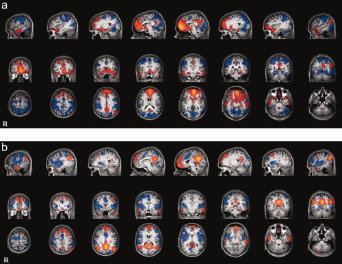
Figure 2.

Positive and negative correlations with each seeded region. (a) vmPFC (orange) and its anticorrelated network (blue). (b) PCC (orange) and its anticorrelated network (blue). [Color figure can be viewed in the online issue, which is available at www.interscience.wiley.com.]
