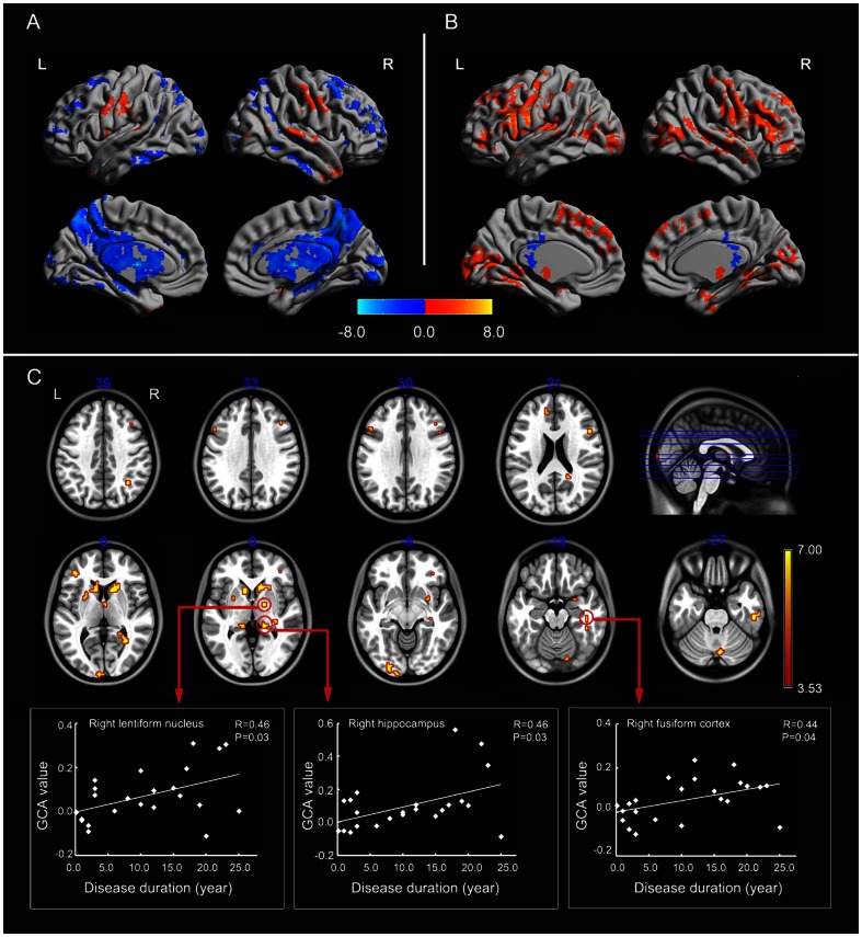
Figure 3. Granger causality analysis for whole-brain-to-seed(EZ).
(A) Regions showing significant causal effect with the seed in patients. (B) Regions showing significant causal effect with the seed in controls. Warm and cold colors indicate positive and negative causal effects, respectively. (C) Regions showing abnormal causal effect with the seed in patients compared with controls. The scatter-plot maps show the correlations between Granger causality value in corresponding clusters and disease duration. Color bar represents t-values.

