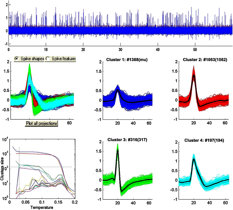
Fig. 2.
Example of spike sorting. The top plot shows 60 s of simulated data. The bottom plots show the superposition of all the spike clusters (left) and each of the sorted clusters, corresponding to one multiunit (cluster 1) and 3 single units (clusters 2, 3 and 4). The number on top of each plot indicates the number of spikes generated (in brackets) and detected by the user.

