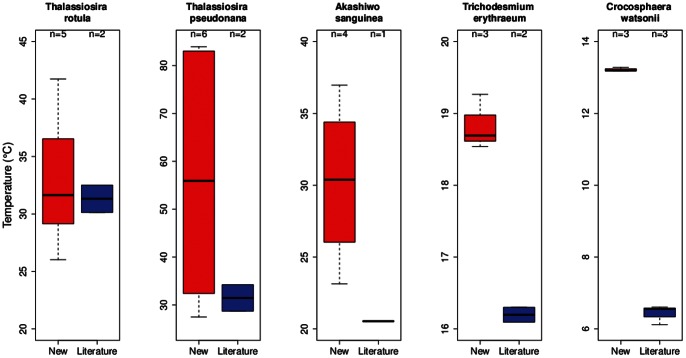
Figure 5. A comparison of the thermal trait, niche width (°C) using box and whisker plots, between previously published studies (using a wide range of experimental protocols, see [43] ) and the species/strains used in the present study.
The black bands denote the median value, the bottom and top of the red/blue boxes represent the 1st and 3rd quartile of the data respectively. The ‘whiskers’ extending from the boxes indicate the positions of the lowest & highest values in the data. If the sample size is small enough, the whiskers may not appear (e.g. if there are only 3 equally spaced points, the value represented as the 1st quartile is the lowest value).

