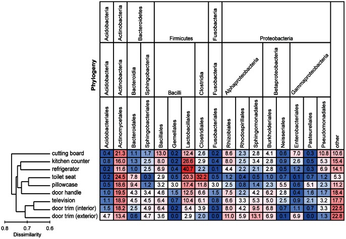
Figure 3. Heat map of the mean relative abundances of dominant bacterial taxa across the nine sampled locations.
Each column is colored so that taxa with high relative abundances are red, intermediate relative abundances are white, and low abundances are blue. The dendrogram on the left summarizes the overall degree of dissimilarity (calculated from unweighted UniFrac values) of the bacterial communities in each of the sampled locations relative to each other. The dendrogram was created using mean UniFrac values for each of the sampled locations.

