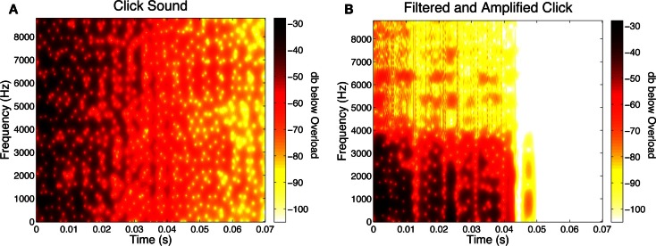
Figure 1.
(A) Spectrogram of the click sound used in Experiment One. This plot shows the amplitude of different frequencies of the sound over time. The color bar represent values of dBov (decibels below overload, which is the maximum amplitude before signal clipping would occur). In the bar in the spectrogram, darker colors represent higher amplitudes. Note that in the spectrogram stimulus amplitude initially is high at frequencies over the entire spectrum, but gradually diminishes over time. (B) Spectrogram of a click used in Experiment Three. The spectrogram shown is for the age-sensitive, filtered click that has been amplified to match the loudness of the unfiltered click. Note that early on, high amplitude is seen only at the lowest frequencies. Notice also, that above ∼3 kHz, amplitudes are less than at the corresponding frequencies in the unfiltered click.

