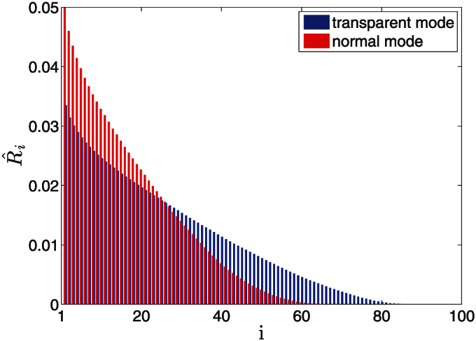
Figure 3. Normalized DebtRank,  for individual banks in the normal (red) and the transparent mode (blue).

Banks are ordered according to their DebtRank, the most risky is to the very left, the safest to the very right. The distribution is an average over 1000 simulation runs with an ER network, and shows the situation at timestep t = 100.
