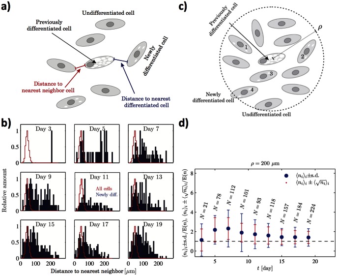
Figure 6. Source of factor secretion.
A) Schematic illustration of the analysis used to investigate the potential increased differentiation due to positional proximity to already differentiated cells. B) Distributions of the average distances between newly differentiated cells and the closest already differentiated cell (blue) compared to the average distance between all nearest neighbor cells (red) for data at the cell density 270 cells/mm2 exposed to AM at Q = 500 nL min−1. Each plot in each panel is normalized by its largest value. C) Schematic illustration of the second independent analysis used to for investigating number of differentiating cells within a certain radius ρ from a differentiated cell. D) Average number of newly differentiated cells exposed to AM within a radius of ρ = 200 μm from each previously differentiated cell normalized by the amount E(n) expected from random placement of all newly differentiated cells in the whole chamber. N indicates the total number of newly differentiated cells detected in the present image. The blue error bars indicate the standard deviation of the number of newly differentiated cells within the radii of the previously differentiated cells, while the red error bars illustrate the average counting error due to finite statistics.

