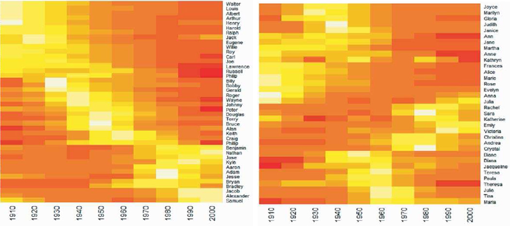
Figure 9.
Heat maps of additional male and female names based on data from the Social Security Administration. Lighter color indicates higher popularity. Three distinct popularity profiles are clear in the male names. The clustering of female popularity profiles is still present, but less clear for the male names.

