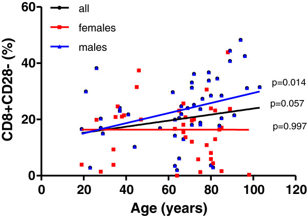
Figure 4.
Frequency distribution of CD28- cells within total CD8+ T cells. The cell markers that PBL were stained for are shown on the Y axis. The linear regression results are represented in different colors for all individuals (black line, n=88), males (blue line, n=48) and females (red line, n= 40). The p values for all individuals are shown on the graphs nearby the regression line, p<0.05 indicates statistical differences..

