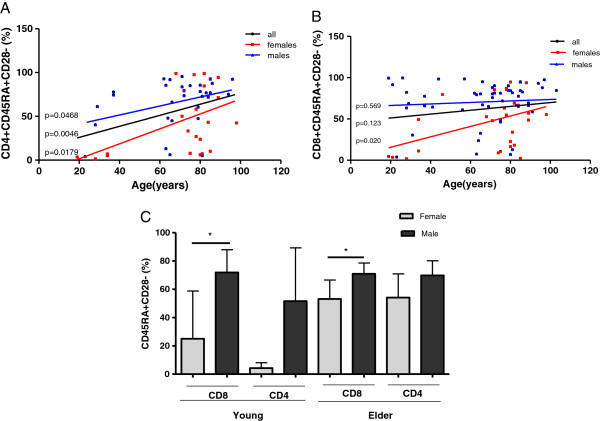
Figure 5.
Frequency of highly differentiated T cells according to ages and genders. A) Linear regression shows the percentages of CD45RA+/CD28- population within total CD4+ T cells for all individuals (black line, n=54), males (blue line, n=31) and females (red line, n=23), p values are shown on the graphs to each regression line. B) Linear regression shows the percentages of the CD45RA+/CD28- population within total CD8+ T cells for all individuals (black line, n= 79), males (blue line, n=51) and females (red line, n=28), p values are shown on the graphs to each regression line. p<0.05 indicates statistical differences. C) Frequency of highly differentiated T cells (within CD4+ and CD8+ subsets) in males and females by age groups. Differences between males (dark gray) and females (light gray) are represented. * indicates significant differences by Mann Whitney test (p<0.05).

