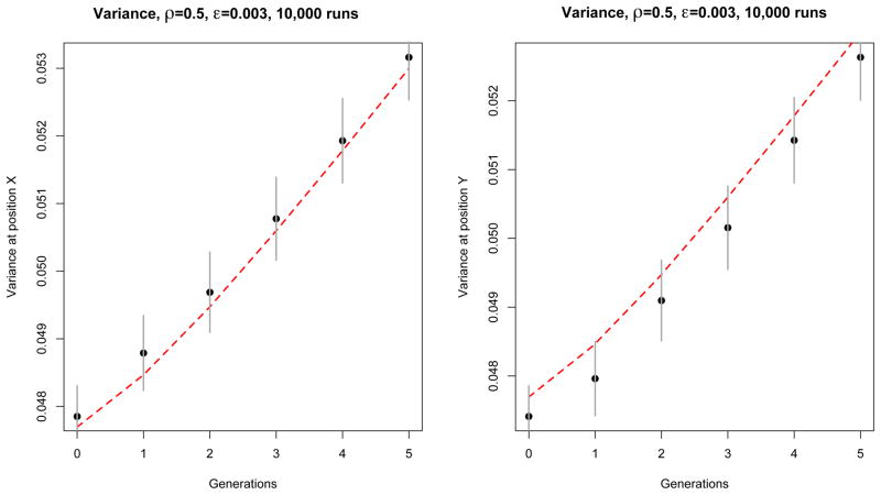
Figure 4.
Comparison between theory (red dashed line) and simulation (black dots) of the contribution of each position (denoted x and y, located at one third and two thirds of the genome) to the variance of HD0 for an exponentially growing population. Here ρ = 0.5 and ε = 0.003. These results were obtained from 10,000 independent simulation runs with the same initial conditions, as described in the main text. The simulation is represented by the black dots, and the theory by the dashed red line. Confidence intervals (±1.96 times the standard deviation over runs) are represented by vertical gray segments. Notice that the errors are positively correlated.

