

Abstract
Fitness landscapes are a classical concept for thinking about the relationship between genotype and fitness. However, because the space of genotypes is typically high-dimensional, the structure of fitness landscapes can be difficult to understand and the heuristic approach of thinking about fitness landscapes as low-dimensional, continuous surfaces may be misleading. Here I present a rigorous method for creating low-dimensional representations of fitness landscapes. The basic idea is to plot the genotypes in a manner that reflects the ease or difficulty of evolving from one genotype to another. Such a layout can be constructed using the eigenvectors of the transition matrix describing the evolution of a population on the fitness landscape when mutation is weak. In addition, the eigendecomposition of this transition matrix provides a new, high-level view of evolution on a fitness landscape. I demonstrate these techniques by visualizing the fitness landscape for selection for the amino acid serine and by visualizing a neutral network derived from the RNA secondary structure genotype-phenotype map.
Keywords: Adaptation, random walk, graph Laplacian
Introduction
The fitness landscape is one of the most influential concepts in evolutionary biology. First proposed by Sewall Wright (1932), a fitness landscape is a mapping from a set of genotypes to fitness, where the set of genotypes is organized according to which genotypes can mutate from one to another (Kauffman, 1993; Stadler, 2002; Gavrilets, 2004). While the structure of the fitness landscape is critical for understanding evolutionary dynamics (Kauffman and Levin, 1987; Weinreich et al., 2005), gaining an intuitive understanding of these landscapes has proved difficult due to the large number of genotypes and high dimensionality of all but the smallest genotypic spaces. For instance, to depict the fitness landscape for even the three locus diallelic case we would ideally need four dimensions (three dimensions to plot the genotypes at the corners of a cube, plus a fourth dimension if fitnesses are to be displayed as heights), while for comprehension and display we are typically limited to two, or perhaps three, dimensions.
Wright proposed two different methods for depicting fitness landscapes. First, for sufficiently small genotypic spaces, he plotted the genotypes individually, connecting two genotypes by a line to denote a possible mutation (Wright, 1932). The specific location at which each genotype was plotted was determined either by designating one genotype as the wild-type and plotting each of the other genotypes according to the number of substitutions between it and the wild-type (Wright, 1932, Fig. 1; 1982, Fig. 6), or in an ad-hoc manner meant to reveal the main qualitative features of the landscape (Wright, 1982, Fig. 3). This type of approach is both useful and uncontroversial since the genotypes and their mutational connectivity are displayed explicitly.
Figure 1.

A one codon fitness landscape with selection for serine and against stop codons. The six serine codons have fitness 1.001, the three stop codons have fitness .999, all other codons have fitness 1.000, N = 3000, natural selection is modeled as a Moran process, and mutation is based on empirically observed rates for yeast (Lynch et al., 2008). (A) Genotypes coding for serine are shown as unfilled circles, all other genotypes are shown as filed circles, and the area of each circle is proportional to its frequency at equilibrium. Edges connect genotypes that differ by a single point mutation. (B) The u3 coordinate of each genotype is plotted against the expected number of generations before a population starting at that genotype would evolve a serine. (C) The probability that a population starting at a given genotype evolves a serine coded for by TCA, TCG, TCC, or TCT before evolving a serine coded for by AGT or AGC is plotted against the u2 coordinate of that genotype.
Figure 3.

A neutral network from the RNA sequence to RNA secondary structure genotype-phenotype map previously studied by van Nimwegen et al. (1999). 51 028 single stranded RNA sequences of length 18 are shown, each of which folds into the same secondary structure. The visualization was produced by assuming that each possible point mutation occurs with probability 1/1000 per generation, that all sequences with the target secondary structure are of equal fitness, and that only such sequences are viable. The sequences fall into 3 clusters (shown by the range bars at the top of the figure), which correspond to the possible base identities for the basepair formed between the 2nd and 17th bases. In the inset, genotypes are colored according to their equilibrium frequency in the strong mutation regime. Genotypes whose occupation is greater than 2.0 × 10−5 = 1/51 028 are shown in black.
Second, Wright argued that we can reason about and understand larger fitness landscapes by employing a topographical metaphor. Specifically, Wright suggested that for a large number of loci we can think of the genotypic space as being effectively continuous, so that as a heuristic matter we can imagine the fitness landscape as being a two-dimensional surface in a three-dimensional space (Wright, 1932). Wright used this approach to create an iconic series of figures depicting evolutionary dynamics in various population genetic regimes (Wright, 1932). These diagrams were incredibly influential, particularly on Dobzhansky and Simpson (Ruse, 1996), and remain the standard way of illustrating ideas about fitness landscapes with more than just a few genotypes (e.g. Orr, 2005; Poelwijk et al., 2007).
This second approach is considerably more controversial. Because Wright provided no explicit or implicit method for producing his diagrams, they were strongly criticized by Wright’s biographer, William Provine, as being “unintelligible” and “meaningless in any precise sense” (Provine, 1986, pg. 310, see also Ruse, 1996; Skipper, 2004). Provine also criticized Wright for later using the same diagrams to illustrate what might more properly be called adaptive landscapes, that is, mappings from allele frequencies to mean population fitness, which is a different, albeit related matter. These criticisms lead Wright to reply, in his last publication before his death in 1988, that while his representations were indeed “useless for mathematical purposes”, “an intelligible representation depends on some enormous simplification” (Wright, 1988, see also Pigliucci, 2008).
Irrespective of their schematic, non-rigorous nature, the question remains of whether Wright’s low-dimensional continuous surfaces provide a set of appropriate intuitions for understanding evolutionary dynamics in high-dimensional discrete spaces. Gavrilets has recently argued that high-dimensional landscapes have qualitatively different features than low-dimensional landscapes (Gavrilets, 1997, 2003, 2004). The crux of the matter is that in a sufficiently large number of dimensions, each genotype also has a large number of mutational neighbors, so large, in fact, that even when fitnesses are assigned at random, each genotype is likely to have at least one neighbor with a similar fitness. If such a situation holds, the set of high fitness genotypes generically forms a connected network (Gavrilets and Gravner, 1997; Gavrilets, 2003, 2004). Thus, while isolated fitness peaks appear quite natural when we consider a low-dimensional surface, which suggests the problem of how a population can move from one local fitness maximum to another (Wright, 1932), in high-dimensional discrete spaces this problem rarely arises, since at long time scales populations typically diffuse neutrally along a network of high fitness ridges that extends throughout the genotypic space. Such criticisms have lead to a serious discussion in the philosophical literature as to whether these low-dimensional representations, or even the topographical metaphor as a whole, ought to be abandoned (Pigliucci and Kaplan, 2006; Kaplan, 2008, see also, Skipper, 2004; Calcott, 2008)
In summary, while adequate methods exist to visualize small fitness landscapes, the low-dimensional representations most evolutionary biologists use to reason about larger fitness landscapes may be highly misleading (Gavrilets, 1997, 2003, 2004). Combined with a rich literature on theoretical and computationally derived fitness landscapes (e.g. Kauffman, 1993; Gavrilets, 2004; Fontana, 2002; Cowperthwaite and Meyers, 2007; Bornberg-Bauer and Chan, 1999; Wagner, 1996; Ciliberti et al., 2007) and a recent resurgence of interest in empirical fitness landscapes (Poelwijk et al., 2007; Dean and Thornton, 2007), this suggests the need for rigorous methods capable of creating low-dimensional representations of large fitness landscapes.
In this paper, I propose just such a method, drawing heavily on recently developed, random walk based techniques for data analysis and dimensionality reduction (Meila and Shi, 2001; Belkin and Niyogi, 2003; Koren, 2005; Coifman and Lafon, 2006; Fouss et al., 2007). The main idea is to create a low-dimensional representation of the genotypic space where genotypes are plotted close together or far apart depending on how easy it is to evolve from one to another. Crucially, the difficulty in evolving from one genotype to another should depend on the fitnesses of intermediate genotypes, so that genotypes separated by a fitness valley should be drawn far apart even if the mutational distance between them is small, and genotypes connected by neutral paths should be drawn close together even if they are separated by many mutations.
The resulting representation of the genotypic space highlights the major features of the fitness landscape as seen by an evolving population. With such a representation in hand, the fitness of each genotype can be displayed graphically using an additional axis or by varying the size or color of the symbols used to plot the genotypes. Alternatively, and perhaps more importantly, these representations can be used to display other types of data, for instance the value of each genotype with respect to traits other than fitness or the results of simulated evolution. These additional applications may allow us to gain new insights into the structure of the genotype-phenotype map and its effects on evolutionary trajectories, a related set of questions plagued by difficulties associated with the large dimensionality of the genotypic space.
To understand how we construct these visualizations, consider a population for which mutations are sufficiently rare that each new mutation either fixes or is lost prior to the next mutation arising. We can view a population in this weak mutation regime as a single particle moving from one genotype to another at the birth of each new mutant destined for fixation. That is, we can view such a population as taking a biased random walk on the fitness landscape, where the bias is due to the action of natural selection combined with any biases in the mutational dynamics.
In this context, a natural measure for the difficulty of evolving from genotype i to genotype j is the expected number of generations it would take to evolve from i to j. While this notion of evolutionary difficulty is not symmetric, in the sense that it might take less time to evolve from i to j then it takes from j to i, we can construct a symmetric notion of difficulty by looking at the sum of the expected time it would take to evolve from i to j and the expected time it would take to evolve from j back to i. Call this sum the commute time, or evolutionary distance, between i and j.
It turns out that by plotting each genotype at coordinates given by some appropriately normalized eigenvectors of the transition matrix describing this random walk, we can construct a high-dimensional representation of the fitness landscape where the squared Euclidean distance between each pair of genotypes i and j is equal to the commute time (evolutionary distance) between them. Furthermore, we can construct a low-dimensional representation of the fitness landscape by only using the eigenvectors associated with the two or three largest subdominant eigenvalues of the transition matrix. This low-dimensional representation turns out to be an optimal projection of the high-dimensional representation in the sense that it is equivalent to doing a principal component analysis on the high-dimensional representation when each genotype is weighted by its frequency at equilibrium.
Besides being easy to compute, which allows us to visualize fitness landscapes containing tens of thousands of genotypes, these eigenvectors have a number of useful graphical and theoretical properties. For instance, the low-dimensional representation I just described is also a stretched version of the representation that minimizes the sum of the squared distances between genotypes where the distance between genotypes i and j is equal to the frequency of fixations from i to j at equilibrium, which intuitively places genotypes close together if fixations from one to the other are frequent at equilibrium. Similarly, when the transition matrix for the random walk is expressed in terms of its eigenvalues and eigenvectors, it becomes natural to think of evolution on a fitness landscape in terms of a set of deviations from the equilibrium distribution, each of which decays geometrically in time at a rate determined by the associated eigenvalue. The eigenvectors used to create the visualizations can then be thought of as showing, for each choice of initial genotype, the weight given to the most slowly decaying of these deviations.
The remainder of the paper is structured as follows. I will describe the evolution of a population on a fitness landscape in the weak mutation regime and give a simple way to view this process in terms of the eigenvectors and eigenvalues of the associated transition matrix. I will then describe the properties of these eigenvectors when used to visualize fitness landscapes. Finally, I will use these techniques to explore evolutionary dynamics on two fitness landscapes. Technical results and detailed methods for the examples are contained in an Appendix at the end of the manuscript.
Defining the random walk
Because our strategy is to use the evolutionary dynamics induced by the fitness landscape to produce a representation of the landscape, we must first describe those evolutionary dynamics. We will make two basic assumptions.
First, as was mentioned in the introduction, we assume that mutation is weak. Specifically, if N is the size of a haploid asexual population and μ is maximal total mutation rate for any genotype, we assume that the expected number of mutants produced per generation, N μ, is small enough that each mutation will typically go to fixation or be lost from the population prior to the appearance of the next mutation. Thus, the probability of fixation for a new mutation is simply a function of the fitness of its genotype, the fitness of the genotype it was derived from, and the population size. Furthermore, since a population with small N μ will typically be composed of a single genotype, we will treat the whole population as a particle that changes state at the birth of a new mutant that is destined for fixation.
Second, we will assume the technical condition that the mutational dynamics are reversible in equilibrium. This assumption is common in models of sequence evolution (see Zharkikh, 1994, for a review), and essentially means that there are no cyclic mutational biases. Our motivation for using it here is that it guarantees that the transition matrix of our random walk can be decomposed in a particularly nice form. Specifically, the mutational dynamics are reversible if and only if for every pair of genotypes i and j, we have πM (i)M (i, j) = πM (j)M (j, i) where M (i, j) is the mutation rate from i to j and πM (i) is the frequency of genotype i at equilibrium in the absence of natural selection. A more illuminating way of putting this is that M (i, j) = ci,j πM (j) where ci,j = cj,i ≥ 0 for all i, j, i.e. the neutral equilibrium frequencies of the genotypes determine the ratio of the forward and reverse mutation rates, but the absolute rates are determined by a nonnegative multiplicative constant that can be chosen separately for each pair of genotypes. For large fitness landscapes most of these constants will be zero, since each genotype will typically only be able to mutate to a small fraction of all possible genotypes. We do assume, however, that there exists some mutational path from any genotype to any other, so that the fitness landscape as a whole is connected. Note that all models with symmetric rates (M (i, j) = M (j, i) for all i, j) are reversible.
The transition matrix for our random walk is the matrix P whose i, j-th entry gives the probability that the state of the population in the next generation will be genotype j, given that the current state of the population is genotype i. Then P (i, j) for i ≠ j is just the probability that a population at genotype i produces a mutant of type j times the probability that the resulting mutant is destined for fixation, while P (i, i) is the probability that no mutant destined for fixation is produced. Using the classical fixation probability (Fisher, 1930; Wright, 1931; Kimura, 1962) derived from the diffusion approximation to the Wright-Fisher process, we have:
| (1) |
This model is similar to the strong selection-weak mutation (SSWM) models frequently used for studying evolution on fitness landscapes (Gillespie, 1983, 1984; Weinreich et al., 2006, reviewed in Orr, 2005), except that it is more general in that it allows neutral and deleterious fixations. Allowing these classes of substitutions is necessary because the long-term behavior of a population evolving on a fitness landscape under weak mutation will often be dominated by the long waiting times for the deleterious fixations needed to cross fitness valleys.
The equilibrium distribution, π for the Markov chain defined by P is given by
| (2) |
which is essentially Wright’s classical stationary distribution in the limit where the expected number of mutations per generation approaches zero (Wright, 1931). It is easy to verify that the Markov chain defined by P is reversible (that is, π(i)P (i, j) = π(j)P (j, i) for all i, j, see e.g., Sella and Hirsh, 2005).
It is useful to analyze Eq. 2 in terms of the aspects of the fitness landscape that do and do not affect the equilibrium distribution. Specifically, the equilibrium distribution is a function of the population size together with the neutral equilibrium frequency and fitness of each genotype (N, πM (i) and fi), but does not depend on the mutational connectivity between genotypes or the absolute rates of mutation between genotypes, which are controlled by the ci,j. Thus, with respect to the equilibrium distribution, it does not matter if each genotype can mutate to all the other genotypes or if each genotype can only mutate to a few neighbors. Similarly, two genotypes with the same fitness and the same neutral equilibrium frequency have the same equilibrium frequency under natural selection regardless of whether one is a local fitness maximum and the other a local fitness minimum. However, we expect the dynamics caused by starting at a local fitness maximum to be quite different than dynamics caused by starting at a local fitness minimum. This suggests that in order to understand the effects of the fitness landscape on an evolving population we need to look at the approach to equilibrium, a topic we take up in the next section.
Although our discussion has been based on the discrete-time, haploid, Wright-Fisher model, analogous results hold when natural selection is modeled using the exact fixation probability for the Moran process, for the diploid case (assuming fitnesses are multiplicative within loci), and for continuous time (Sella and Hirsh, 2005; for additional results and discussion, see also Iwasa, 1988; Barton and Coe, 2009).
Eigendecomposition of the transition matrix
Because the equilibrium distribution is independent of the structure of the fitness landscape, we will focus instead on the approach to equilibrium. The decomposition of the transition matrix in terms of its eigenvalues and eigenvectors can be used to give a simple and intuitive characterization of these transient dynamics (eigenvector expansions have a storied history in population genetics, see e.g. Kimura, 1955 for their use in solving the diffusion approximation).
We begin by finding the eigenvectors. Let D be the diagonal matrix with D(i, i) = π(i). Because the Markov chain defined by P is reversible, π(i)P (i, j) = π(j)P (j, i) for all i, j which implies that the matrix D1/2P D−1/2 is symmetric. Thus all the eigenvalues of D1/2P D−1/2 are real and it has a full set of orthonormal eigenvectors. Let λ1 ≥ λ2 ≥ … ≥ λn be the eigenvalues of D1/2P D−1/2, and let q1, …, qn be its orthonormal eigenvectors, where qk is the eigenvector associated with λk. Since P and D1/2P D−1/2 represent the same linear transformation expressed in different systems of coordinates, the λk are also the eigenvalues of P. Furthermore, D1/2qk is a left eigenvector of P with eigenvalue λk and D−1/2qk is the associated right eigenvector. Since P is stochastic, non-negative and irreducible, λ1 = 1 > λ2, and the assumption that N μ ≪ 1 implies, by the Gersgorin disc theorem, that λn ≥ 1 − 2N μ > 0 (Horn and Johnson, 1985).
It is easy to verify that the top left eigenvector, D1/2q1 is just the equilibrium distribution, π, and the top right eigenvector, D−1/2q1, is the vector of all ones, (1, …, 1). Since the left eigenvectors for k ≥ 2 are orthogonal to D−1/2q1 = (1, …, 1), each of the lower left eigenvectors has entries that sum to zero, so that adding one of these eigenvectors to the equilibrium distribution still results in a vector whose entries sum to one. Thus, it is natural to regard the left eigenvectors of P as a basis for the set of probability distributions over genotypes, where each of the lower left eigenvectors can be viewed as a deviation from the equilibrium distribution.
The significance of this interpretation becomes clear when we look at the influence of the fitness landscape on an evolving population. Suppose our population starts out at genotype i at generation zero. Let xi,t(j) be the probability that the population is at genotype j at generation t. By expressing P in terms of its eigenvalues and eigenvectors we have
| (3) |
What Eq. 3 says is that the probability distribution describing the location of the population can be expressed as a sum of deviations from the equilibrium distribution, where each deviation, D1/2qk for k ≥ 2, decays geometrically in time with parameter λk < 1. Clearly as t becomes large, the terms become very small, so that xi,t becomes close to π independent of the initial genotype i. However, the terms for small k become small more slowly than the others, so that the associated eigenvectors can be thought of as the deviations from equilibrium that persist longest. Thus, it is the D1/2qk for small k that summarize the long-term effects of the fitness landscape itself, as opposed to the fitnesses of the genotypes that compose it.
What about the right eigenvectors of P? In Eq. 3, the deviations from equilibrium and the rate of decay of each deviation are independent of the initial genotype. What the initial genotype determines are the weights for each of these geometrically decaying deviations, and these weights are given by the lower right eigenvectors of P. That is, if the population starts at genotype i the weight on the deviation from equilibrium described by the left eigenvector D1/2qk is given by the i-th entry in the corresponding right eigenvector, D−1/2qk (i).
More abstractly, just as the left eigenvectors of P serve as a natural basis for probability distributions on the set of genotypes, the right eigenvectors of P serve as a natural basis for functions on the set of genotypes when each genotype is weighted by its frequency at equilibrium. For instance, suppose we want to know the covariance at equilibrium between two functions on the set of genotypes whose values are given by the vectors a and b, where a and b are mean-centered, i.e. πTa = πTb = 0. Then we have covπ(a, b) =Σi π(i)a(i)b(i) = bTDa. This calculation suggests that the natural inner product for functions on genotypes is given by 〈a, b〉 ≡ bTDa. It is easy to verify that the D−1/2qk provide an orthonormal basis with respect to this new, weighted inner product.
Characterizing the visualizations
The preceding discussion suggests that for an m-dimensional representation of the fitness landscape, we might choose to plot genotype i at (D−1/2q2(i), D−1/2q3(i), …, D−1/2qm+1(i)), since these coordinates express the effects of starting a population at genotype i in terms of the weights given to the most slowly decaying deviations from equilibrium. Intuitively, if the long-term evolutionary consequences of starting at two genotypes are similar to each other, they should be plotted close together in such a representation, and indeed, this representation has a number of nice properties.
If we consider the frequency of fixations from genotype i to j at equilibrium, it would make sense to plot i and j close together if such fixations occur frequently. In fact, the representation given above minimizes the sum of the squared distance between genotypes, where the squared distance between each pair of genotypes is weighted by the frequency of fixations from one to the other at equilibrium, subject to the constraint that when each genotype is weighted by its equilibrium frequency the representation is mean centered with unit variance along each axis and zero covariance between axes.
To see why the right eigenvectors of P give the solution to this minimization problem, it helps to view our fitness landscape as defining an undirected graph with edge weights W(i, j) = π(i)P (i, j) = π(j)P (j, i), Thus, the weight between two genotypes is equal to the frequency of fixations from one to the other at equilibrium. Associated with the graph defined by W is a matrix L, known as the graph Laplacian (Mohar, 1991; Godsil and Royle, 2004), where L(i, j) ≡ Σk≠i W (i, k) if i = j and −W (i, j) otherwise. The graph Laplacian is useful because it encodes the weighted sum of the squared distances between genotypes, i.e. for an axis where the position of genotype i is given by v(i), we have
| (4) |
The constrained minimization problem given above can then be restated in terms of finding the generalized eigenvectors of L with respect to the weight matrix D (Koren, 2005). Because L can also be written as L = D(P − I), where I is the identity matrix, these generalized eigenvectors of L are simply the right eigenvectors of P (see the Appendix for more details).
One defect of this representation is that it is independent of the absolute time scale of the evolutionary dynamics. For instance, it is easy to show that multiplying all mutation rates by a constant c will change the eigenvalues of P but not its eigenvectors, and thus will not change the representation described above. To solve this problem, recall that by Eq. 3, the contribution of each deviation from equilibrium decays geometrically in time with parameter λk. This geometric decay has an associated time scale given by the relaxation time 1/(1−λk ), meaning that the larger λk decay over longer time scales. By scaling each axis of the representation by the square-root of the associated relaxation time, we can create a representation where squared distances have units of generations. In particular, let for k ≥ 2, and plot genotype i at (u2(i), u3(i), …, um+1(i)). This new representation has the same fundamental geometry as our original representation, since we have simply stretched the axes, but now multiplying all mutation rates by a constant c will multiply all coordinates by .
This rescaled representation has the following interpretation. Define the first passage time from genotype i to genotype j as the expected number of generations it would take a population starting at genotype i to evolve to genotype j. Ideally, we would want distances in our visualizations to reflect these first passage times, but the first passage time from i to j is generally not equal to the first passage time from j to i, whereas distances in the visualizations must be symmetric. Instead, define the commute time between i and j to be the expected time it would take to evolve from genotype i to genotype j and then back to i. The commute time is clearly symmetric because it is simply the sum of the first passage time from i to j and the first passage time back from j to i. It turns out that if we make a high-dimensional representation of the fitness landscape using all n − 1 of these rescaled axes, then the squared distance between any two genotypes is equal to the commute time between them (see Appendix). Furthermore, when the position of each genotype is weighted by its equilibrium frequency, the axis corresponding to λk has variance equal to the relaxation time of the associated deviation from equilibrium, 1/(1 − λk ), which is decreasing in k, and there is zero covariance between axes. Thus, this high-dimensional representation is already expressed in its principal component axes, so that a low-dimensional representation where genotype i is plotted at (u2(i), u3(i), …, um+1(i)) is equivalent to conducting a principal component analysis on a high-dimensional representation where the squared distance between genotypes is equal to the commute time between them.
Because a principal component analysis creates a variance maximizing projection, intuitively we can think about this procedure as projecting the high-dimensional representation onto a subspace that lies near the genotypes that are both high fitness (and hence have high frequencies at equilibrium) and for which it is difficult to get from one to the other. However, in the introduction I suggested that the commute time can be thought of as a kind of evolutionary distance, and indeed the commute time defines a distance measure (i.e. a metric) on the set of genotypes (Fouss et al., 2007). This leads to the question of why this type of projection is preferable to a method that attempts to preserve the distance relations directly, such as Sammon’s mapping (cf. Kim and Moon, 2003). First, it is important to realize that the largest commute times will typically be between unfit genotypes, so that these relationships will dominate such a drawing, whereas we are usually most interested in the evolutionary relationships between the fittest genotypes. Second, for large fitness landscapes, computing the commute times quickly becomes impractical, since for n genotypes it requires finding all n eigenvectors. On the other hand, creating a two or three dimensional representation based on the procedure described above only requires calculating the three or four eigenvectors associated with the largest eigenvalues, and this is practical for fitness landscapes containing tens of thousands of genotypes, particularly if the associated transition matrix is sparse, as will typically be the case.
One concern about our use of commute times is that often we are most interested in the forward-time dynamics of the Markov chain so that the first passage time in one direction might be more interesting to us than the reverse first passage time. The most obvious place where such asymmetry is likely to be important is when genotype i with lower fitness has a direct path of increasing fitness to genotype j which is a fitness peak. While the commute time interpretation may not be particularly useful in this case, remember that by hypothesis a population starting at genotype i will quickly find itself at genotype j. With respect to the waiting time for the Markov chain to reach some other genotype k on a different fitness peak, the long-term consequences of starting at i are similar to starting at j and it makes sense to plot the two genotypes close together.
A more serious objection is that we are most often interested in the transient response of the Markov chain and not the longer time scale where most hitting times occur (after all, in nature we suspect that the set of genotypes that ever come into existence will typically be a tiny fraction of the set of possible genotypes). I will have more to say on this issue in the future, but for now allow me to point out that the representations proposed here actually have a beautiful geometric interpretation in terms of the forward-time evolutionary dynamics. Consider the full n − 1 dimensional representation where genotype i is plotted at (u2(i), u3(i), …, un (i)), and imagine each genotype as a ball, the weight of which is proportional to its current frequency. At equilibrium, the representation as a whole is balanced, in the sense that its center of gravity lies at the origin, since πTuk = 0 for k > 2. On the other hand, when our population starts at genotype i, we can think of a single ball, with all the weight lying at (u2(i), u3(i), …, un (i)), so that there is an imbalance that lies along the line from the origin to (u2(i), u3(i), …, un (i)). How does the center of gravity, that is, the expected position of the population in the high-dimensional representation, approach the origin? Because for l ≠ k, the movement of the expected position of the population along each axis of the representation is controlled entirely by the decay of the corresponding deviation from equilibrium. Thus, at time t the expected position is simply ( ), i.e., the center of gravity decays geometrically along each axis. Because the decay is fastest along uk for larger k, after a sufficient amount of time, we expect the center of gravity to lie near the subspace that we plan to project onto to create our low-dimensional representation. Furthermore, what remains of the imbalance, in terms of the entire probability distribution describing the location of the population, lies along a direction specified by the vector from the origin to this center of gravity. Since this vector lies near our subspace, variation along it should be preserved when we carry out our projection, resulting in a useful depiction of the remaining imbalance.
Having described several interpretations for the visualizations derived from the eigenvectors of P, I should stress that the utility of the visualizations does not come from any one of these interpretations, but rather from their confluence. The visualizations are easy to calculate, and reflect several different features of evolution on the fitness landscape. It is also important to note that these visualization techniques will work for any finite state reversible Markov chain and, indeed, a variety of similar frameworks exist for the more general case (Belkin and Niyogi, 2003; Coifman and Lafon, 2006; Fouss et al., 2007). Each of these approaches has a different goal at hand, whether to recover the structure of a manifold embedded in a high-dimensional space, or calculate the similarities between users in a database, and hence each approach has somewhat different technical properties. Here, at each step, I have strived to maximize the relevance of the visualization and analytical techniques for questions of evolutionary interest, for instance by having the visualizations emphasize the relationships between the fittest genotypes and having them reflect the absolute time scale of the dynamics so that visualizations of different fitness landscapes will be in some sense comparable. Nonetheless, other visualization methods may be as, or more, useful than the one proposed here depending on the structure of the fitness landscape and the specific questions being asked, and such methods should certainly be pursued.
Examples
To illustrate these techniques, let us look at two examples. Both examples are based on two-dimensional versions of the rescaled representation where genotype i is plotted at (u2(i), u3(i)). Visualizations based on the unscaled coordinates are similar, if somewhat less informative.
A one codon fitness landscape
Fig. 1A shows the fitness landscape for a single codon under selection for the amino acid serine and selection against stop codons. Mutation is modeled with a realistic mutation scheme derived from empirical observations in yeast (Lynch et al., 2008, see Appendix). Codons that code for serine are represented by unfilled circles, the size of each genotype is proportional to its frequency at equilibrium, and edges connect genotypes that differ by a single point mutation.
Serine is unique among the amino acids because it is coded for by two sets of codons that are not contiguous under point mutations. Hence, selection for serine produces a two-peaked fitness landscape. The visualization shows these peaks as being broadly separated (Fig. 1A) because commute times between codons are short within a peak (substitutions occur at the neutral mutation rate), but long between peaks (there is a long waiting time for deleterious fixations, and there is also a reasonable probability that a population which does leave one peak will simply return to the same peak). Note that the various serine codons have different equilibrium frequencies due to the strong AT mutational bias in yeast.
Just as the coordinates derived from a principal component analysis sometimes correspond to intuitively identifiable features of the data set (for instance, the first principal component in a morphometric data set sometimes corresponds to overall size), the axes in Fig. 1A also have intuitive interpretations. For instance, one obvious question is: given that a population starts at a particular codon, what is the expected waiting time until it evolves to a genotype that codes for serine? This waiting time can be calculated using standard results in the theory of finite state Markov chains (Kemeny and Snell, 1976) and corresponds roughly to the the u3 coordinate (y-axis in Fig. 1A; Fig. 1B shows the u3 coordinate of each genotype plotted against this waiting time). Similarly, we can calculate the probability that a population starting at any given genotype will first reach the cluster of serine genotypes containing the codons TCA, TCG, TCT and TCT. This probability has a strong linear relationship with the u2 coordinate of each genotype (x-axis in Fig. 1A; Fig. 1C shows the probability of first reaching this larger cluster plotted against the u2 coordinate of each genotype). Returning to Fig. 1A, we can at a glance assess the mutational connectivity, equilibrium frequency, and evolutionary fate of each genotype.
Because the transition matrix for the evolutionary random walk will typically be a function of population size (the strength of natural selection, and hence the bias in this random walk, increases with increasing population size), each fitness landscape actually defines a family of visualizations parametrized by the population size, N. Fig. 2 shows a sequence of visualizations of the serine fitness landscape with increasing N. In the absence of natural selection, N = 1, the visualizations are highly symmetric (see Appendix), reflecting the symmetries of the genotypic space and the mutational dynamics. As N increases, the visualizations are increasingly deformed by the action of natural selection. In particular, notice the increasing distance between the two fitness peaks with increasing N, which reflects the increased waiting time for deleterious fixations.
Figure 2.
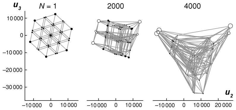
The fitness landscape from Fig. 1A is shown for three different population sizes, N. For N = 1, the representation is highly symmetric, reflecting the neutral population dynamics. As N increases, the representation becomes increasingly deformed, reflecting the increasing power of natural selection. Notice that for increasing N, the equilibrium frequency of codons coding for serine increases (unfilled circles), and the distance between the two fitness peaks also increases, reflecting the longer waiting time for deleterious fixations.
A neutral network
To demonstrate these techniques on a larger landscape, we will visualize a landscape previously investigated by van Nimwegen et al. (1999). This landscape is derived from the RNA sequence to RNA secondary structure genotype-phenotype map (Cowperthwaite and Meyers, 2007), and consists of 51 028 single-stranded RNA sequences of length 18 that are contiguous under point mutations and which all share a single minimum free energy secondary structure (see Appendix for details). Such a set is known as a neutral network (Cowperthwaite and Meyers, 2007). We assume strong stabilizing selection on secondary structure so that genotypes on the network are neutral relative to each other and genotypes off the network never fix. We can think of this as a ‘fitness mesa’, that is, a fitness peak that is flat on top, with very steep sides. Our visualizations allow us to picture the top of this mesa.
Strikingly, the visualization of this network picks out 3 well-separated clusters along the u2 axis (Fig. 3). On the left is a cluster of 47 019 genotypes, and on the right is another cluster of 3718 genotypes. These clusters are connected to each other only via a much smaller third cluster of 291 genotypes, each of which has exactly one neighbor in the left cluster and one neighbor in the right cluster. In other words, this fitness mesa is really composed of two large, separate regions, connected by a bottleneck or narrow ridge.
RNA chemistry provides a simple explanation for these clusters. When a single stranded RNA molecule folds up on itself to form a secondary structure, it can make three types of basepairs: the Watson-Crick GC and AU basepairs, and also the ‘wobble’ basepair GU. A sequence of mutations that changes a GC into an AU basepair while maintaining the basepair in question (and hence the secondary structure) must go through a GU intermediate (Gruner et al., 1996). The clusters turn out to correspond to a basepair in this particular secondary structure formed between bases 2 and 17 in the single stranded RNA sequence (see the range bars at the top of the Fig. 3).
Indeed, this narrow ridge has a profound affect on the evolutionary dynamics. Just as transitions between separated fitness peaks are unlikely because of the necessity of deleterious fixations, transitions between the two large clusters in this neutral network occur infrequently because it is unlikely for a wandering population to find the narrow ridge that connects them. For instance, for a population to pass from the GC region to the AU region, it is necessary that it first be at one of the .6% of genotypes in the GC region that can even mutate to the GU region. Then, from the GU region, it has a 50% chance of mutating back to the GC region rather than passing through to the AU region. This causes the time scale over which the base identities equilibrate to be approximately 100 times longer for bases 2 and 17 than for an unpaired base (see Appendix). Because the situation that would create this type of narrow ridge is typical of RNA chemistry, I hypothesize that these narrow ridges, and their attendant effects on sequence evolution, are common in RNA neutral networks.
Why does the visualization pick out these clusters? Because all genotypes on the network are equally fit and there are no mutational biases, Eq. 2 tells us that at equilibrium, that is at the very longest time scales, an evolving population is equally likely to be at any genotype. However, the narrow ridge means that at shorter time scales a population that starts on one side of the ridge is likely to remain on the same side. Recall that the position of each genotype along the u2 axis corresponds to the contribution of starting at that genotype to the most slowly decaying deviation from the equilibrium distribution. The fact that the two large regions and the ridge between them are arrayed across the u2 axis tells us that the effects of the ridge correspond to the most slowly decaying deviation from the equilibrium distribution. The fact that the u2 values of most genotypes within each of the large regions fall in a relatively narrow range tells us that what matters with respect to this deviation is which region a population starts in, and not which particular genotype within that region.
The original purpose of the van Nimwegen et al. paper was to discuss the differences between the weak mutation regime that these visualizations are based on, where the product of population size and mutation rate is very small, and the strong mutation regime where the product of population size and mutation rate is very large so that mutation becomes deterministic and populations are typically polymorphic. In contrast to the weak mutation regime where at equilibrium a population is equally likely to be at any single genotype, in the strong mutation regime a population spreads to cover the whole neutral network in a manner that increases the long-term proportion of mutants that remain on the network, a phenomenon van Nimwegen et al. call “the neutral evolution of mutational robustness”. In Fig. 3 (inset), genotypes that are enriched in the strong mutation regime relative to a uniform distribution are colored black while all other genotypes are colored gray. Only 16% of the genotypes are enriched, but 91% of a population at equilibrium in the strong mutation regime is composed of these genotypes. Notice that the region of enrichment appears quite compact in the visualization, and is limited to the GC cluster. The AU cluster, on the other hand, is highly depleted under strong mutation. Although this region contains 8% of the genotypes, it contains only 1/200 000-th of the population in the strong mutation regime. Thus, even though our visualizations are based on the weak mutation regime, they can be used as a scaffold to understand other population genetic situations.
Discussion
In this paper I have presented a rigorous and interpretable method for visualizing fitness landscapes. This solves a long-standing problem in evolutionary biology because much of the reasoning about fitness landscapes has involved a visual metaphor in which the fitness landscape is depicted as a low-dimensional continuous surface. However, such reasoning may not provide appropriate intuitions for evolutionary dynamics in high-dimensional discrete spaces (Gavrilets, 1997, 2004), and furthermore, no procedure exists to construct these surfaces from actual data (Provine, 1986).
To summarize my main results, when mutations are sufficiently infrequent, a population can be viewed as taking a biased random walk on the set of genotypes, where the bias is due to the combined action of natural selection and any mutational biases present. This random walk can be understood intuitively in terms of the eigenvalues and eigenvectors of its transition matrix. The left eigenvector of the transition matrix associated with its largest eigenvalue, which is 1, gives the equilibrium distribution of the random walk, while the left eigenvectors associated with the lower eigenvalues can be thought of as deviations from the equilibrium distribution, each of which decays geometrically in time. Meanwhile, the right eigenvectors of the transition matrix give, for each choice of initial genotype, the initial weight of each of these deviations, and provide a natural set of coordinates with which to represent the fitness landscape. When these eigenvectors are rescaled appropriately, they can be used to create a high-dimensional representation where the squared Euclidean distance between genotypes is equal to the commute time between them, and this commute time can be thought of as a kind of evolutionary distance that reflects the difficulty of evolving from one genotype to another. By only using the right eigenvectors associated with the most slowly decaying deviations from equilibrium, we can construct low-dimensional visualizations that both reflect the evolutionary distances between genotypes and summarize the most important effects of the fitness landscape on an evolving population.
These pictorial representations may be particularly useful for hypothesis generation, intuition building, and the display of phenotypic or population-genetic data. Patterns that may not be obvious by other means can be readily apparent in visualizations, and the large-scale features of the fitness landscape may have broad explanatory significance, particularly if these large-scale features are comprehensible in terms of the structural, or biophysical, basis of the genotype-phenotype map (Dean and Thornton, 2007). This was indeed the case in the two examples studied here. The RNA secondary structure neutral network turned out to have three clusters, and these clusters corresponded to the three possible RNA basepairs (GC, GU and AU) at a particular location in the secondary structure. Similarly, the fixity of the amino acid code means that selection for serine will generally create multi-peaked fitness landscapes. Peak shifts at conserved serine residues should be observable in nature. More generally, because the visualization methods are so closely related to the evolutionary dynamics being studied, the qualitative features of any particular visualization are likely to correspond to evolutionarily important features of the fitness landscape.
One limitation of these methods is that they require exhaustive knowledge of the fitnesses over the genotypic space in question. Fortunately, advances in high-throughput technologies are making it increasingly possible to systematically phenotype large numbers of genotypes, and this phenotypic data can be used to define fitness landscapes by assuming an additional mapping from phenotype to fitness. For instance, it is now possible to determine the affinity of a transcription factor for every short DNA sequence of length 8 (Berger et al., 2006). These affinities can be viewed as defining a fitness landscape with respect to selection for transcription factor binding (Rowe et al., 2010), which can then be visualized to better understand the evolution of transcription factor binding sites. In the same manner, computational methods that can predict phenotype from genotype, such as the RNA sequence to RNA secondary structure genotype-phenotype map investigated above (Fontana, 2002; Cowperthwaite and Meyers, 2007), can be used to define fitness landscapes over even larger spaces. These visualization methods may also provide new insights into well studied theoretical models, such as Kauffman’s NK-landscapes (Kauffman, 1993) and Wagner’s model for transcriptional regulation (Wagner, 1996), where determining the fitness of each genotype presents no difficulty.
Previous investigations into the structure of fitness landscapes have tended to consider the fitness landscape independently from its effects on population dynamics. For instance, the few previously proposed methods for visualizing fitness landscapes that are too large to treat in an ad hoc manner have focused on the hamming distances between local fitness maxima (Kim and Moon, 2003; Ashlock and Schonfeld, 2005) or attempted to expose repeated features of the landscape (Wiles and Tonkes, 2006), but the resulting visualizations are not particularly informative from a population genetic perspective. Similarly, the mathematically sophisticated theory of fitness landscapes developed by Stadler and colleagues (for a review, see Stadler, 2003) attempts to decompose the fitness function in terms of a basis determined by the structure of the genotypic space (which is permitted to be much more general than the mutational spaces considered here). Indeed, if we were to remove natural selection from our analysis, then we would have exactly the type of analysis advocated by Stadler. The key benefit of incorporating natural selection is that it usually will produce evolutionary dynamics that are less symmetrical than for the neutral case. This reduction of symmetry is what allows us to make an informative low-dimensional representation of the fitness landscape (see Fig. 2).
The action of natural selection may also increase the predictability of evolution. While results from small empirical fitness landscapes suggest that adaptive evolution may follow relatively few paths (Weinreich et al., 2006; Lozovsky et al., 2009), the inclusion of neutral and deleterious fixations and the consideration of longer times scales and larger fitness landscapes is likely to result in each particular evolutionary trajectory being extremely unlikely. Nonetheless, we might be able to regain a sense of predictability by using the eigendecomposition of the transition matrix. For instance, if a set of genotypes are clustered in the low-dimensional representation, it means that the probability distribution describing the long-term fate of a population is similar regardless of which of those genotypes the population starts at. That is, we may be able to gain intuitions about distributions of outcomes, even if any specific outcome is unlikely. Likewise, if there is a gap between the largest subdominant eigenvalues of the transition matrix and the smaller eigenvalues, it means that there is a separation of time scales, so that there is fast mixing within certain sets of genotypes and much slower mixing between such sets. This situation might suggest a coarse-grained view of evolution on fitness landscapes where we can predict which transitions between fast-mixing sets are likely to occur, and via what sort of paths, without predicting any particular sequence of genotypes.
More broadly, the techniques developed here provide an integrated framework for both analyzing and visualizing the structure of fitness landscapes. These techniques may provide the beginnings of a new, large-scale view of evolution on fitness landscapes.
Acknowledgments
Thanks to P. Magwene and D. McShea for comments on the manuscript, and M. Maggioni, S. Gavrilets and P. Shah for helpful discussion. Comments from N. Barton and two anonymous reviewers also improved the manuscript. This work was supported in part by a grant to the Duke Center for Systems Biology (NIH P50GM081883-01).
Appendix
Mathematical methods
In the main text, I claim that the representation plotting genotype i at (D−1/2q2(i), …, D−1/2qm+1(i)) minimizes the sum of the weighted squared distance between genotypes (where the weight on the distance between genotypes i and j is given by the frequency of fixations from i to j at equilibrium, π(i)P (i, j)), under the constraint that when each genotype is weighted by its equilibrium frequency, the representation has unit variance along each axis, zero-covaraince between axes, and mean position at the origin.
Following Koren (2005), recall that the graph Laplacian associated with W = DP is given by L = D − W = D(I − P ). Using the fact that L is symmetric, we have:
Then for an l dimensional representation where genotype i is given coordinates (v1(i), … vl (i)), the weighted sum of the squared distances between genotypes (where the weight on the distance between genotypes i and j is given by π(i)P (i, j)) is:
| (5) |
It is well-known that since L is a symmetric matrix and D is positive definite, the minimizers of this expression subject to the constraint that for i = j and 0 for i ≠ j are given by the D-orthonormal generalized eigenvectors of (L, D) corresponding to the l smallest eigenvalues of L (Koren, 2005). These eigenvectors are simply D−1/2q1, …, D−1/2ql since
That is, the eigenvalues of L are given by 1 − λi and the associated D-orthonormal generalized eigenvector of (L, D) is D−1/2qi. We wish to introduce the additional constraint that πTDvi = 0 for all i. This condition is satisfied by D−1/2q2, …, D−1/2ql, and indeed, these are the minimizers of Expression 5 under this additional constraint if only m = l − 1 vectors are required. To see why, note that (D−1/2q1)T L(D−1/2q1) = (D−1/2q1)T (1 − λ1)(D−1/2q1) = 0, since λ1 = 1. This means that the first term in Expression 5 is zero for the minimizers of the unconstrained problem, and the remaining terms have the same value as our proposed minimum for the constrained problem. Thus, if the D−1/2q2, …, D−1/2ql were not the solution to the constrained problem, then we could have found better minimizers in the absence of this additional constraint.
In the main text we rescaled the axes defined by the D−1/2qk by plotting genotype i at coordinates (u2(i), …, um+1(i)), where for k ≥ 2. I claimed, for the case m = n − 1, that the squared distance between each pair of genotypes was equal to the commute time between them. Let H(i, j) be the expected number of generations it would take to evolve from genotype i to genotype j and call this the first passage time from i to j. We can compute the commute times by first computing the first passage times (after Lovasz, 1993). By a first step argument, we have
| (6) |
since if the population is not initially at j it has to be somewhere after the first time step, and then it still needs to get to j from there. Let J be the matrix of all 1s and 1 be the vector of all 1s. Then by Equation 6 we know that J + P H − H is diagonal. Furthermore, since π is a probability distribution and πTP = πT, it is easy to show that πT(J + P H − H) = 1T, and hence J + P H − H = D−1. Rearranging, we get
| (7) |
Ideally we would like to solve for H by inverting I − P, but this is impossible since I − P has a single zero eigenvalue corresponding to its eigenvector 1. Thus, we can only solve for H up to the addition of some matrix 1aT for any vector a. However we can eliminate this uncertainty by using the fact that H(i, i) = 0 for all i. If we can find a matrix X that satisfies Eq. 7 when used in place of H, we can find H by, for each j, subtracting X(j, j) from each entry in column j of X. It is easy to verify that one solution is given by X = (I − P + 1πT)−1(J − D−1). Expanding P in terms of the uk as , we have:
Then, since H(i, j) = X(i, j) − X(j, j) we have
Finally, the commute time between i and j is
which is simply the squared distance between genotype i and j in the representation of the fitness landscape using all n − 1 of the ui.
The commute time characterization of the visualizations is also useful for demonstrating the utility of these methods for the continuous-time case. If xt is the vector whose i-th entry describes the probability that our population is at genotype i at time t, we can define a continuous-time stochastic process as
This process is reversible and has the same equilibrium distribution as the discrete-time process (Sella and Hirsh, 2005). A useful interpretation of the continuous-time model is that the deterministic length 1 waiting times between events in the discrete-time model are replaced with independent exponential waiting times with mean length 1 (we interpret staying at the same genotype as a possible event). Suppose our population starts at genotype i and we want to know the first passage time for genotype j ≠ i. The population is at some genotype after this first event, the probability that it is at any given genotype is still given by the j-th row of P, and the expected waiting time for this first event is 1. Hence the first-step argument leading to Eq. 6 holds in the continuous-time case, first passage and commute times are identical between the two models, and the interpretation of the visualizations based on the ui are the same.
Methods for the serine landscape
The serine landscape was constructed by assuming that codons that code for serine have fitness 1.001, all other amino acids have fitness 1.000, and stop codons have fitness 0.999. Natural selection was modeled using the exact fixation probability for the Moran process with N = 3000.
The mutational dynamics were based on data from a recent study where Saccharomyces cerevisiae mutation accumulation lines were subject to high-throughput sequencing (Lynch et al., 2008). There were 4 lines, which went through approximately 4800 generations each. An average of 4.99 × 10⁶ nucleotides were sequenced per line, and the A/T content was 59%. 33 mutations were observed in these lines, 2 A:T → T:A, 4 A:T → G:C, 5 A:T → C:G, 8 G:C → A:T, 9 G:C → T:A, and 5 G:C → C:G (note that the data reported in Lynch et al., 2008, are not internally consistent; M. Lynch has confirmed to me that these are the correct numbers, personal communication).
If the two strands of the DNA molecule are treated symmetrically, then the mutation rates for each position in the codon are given by a matrix of the form:
where M (i, j) gives the probability that a parent with nucleotide i at a particular position will have an offspring with nucleotide j when the nucleotides are listed in the order A, T, G, C. The stationary distribution for such a Markov chain is given by
It is easy to confirm that the mutational dynamics will be in detailed balance in the absence of selection if and only if eb = cd.
The Lynch et al. (2008) data imply that M is given by
where I is the identity matrix. Thus,
As will be typical for empirical data, eb is not exactly equal to cd, and so this matrix will not produce a Markov chain in detailed balance. However, we can make some small changes to this matrix to produce a Markov chain in detailed balance. One way to do this is to make equal proportional changes to b, c, d and e. In particular, if , and we replace b with bx, c with c/x, d with d/x and e with ex, then for the Lynch et al. data we have so that M is given by
This altered M matrix gives a Markov chain in detailed balance and was used to create Figures 1 and 2 in the main text. Calculating the expected number of mutations of each type under this new model, we find there should be 4.1 A:T → G:C (4 observed), 4.9 A:T → C:G (5 observed), 7.8 G:C → A:T (8 observed) and 9.2 G:C → T:A (9 observed). Since only a whole number of mutations can be observed, and our expected number of mutations for each class is always within 1 of the observed number, this minor modification is clearly reasonable.
For the case of N = 1 in Fig. 2, the top three non-unit eigenvalues of P were all equal, i.e. λ2 = λ3 = λ4, which is another reflection of the highly symmetric neutral dynamics. In such an instance any choice of two out of the three associated eigenvectors is equally optimal mathematically, and so the choice can be made on the basis of which subset of eigenvectors provides the most useful representation. Note that for N > 1 the action of natural selection breaks this symmetry and provides an unambiguous set of coordinates.
Methods for the RNA neutral network
The network was constructed using breadth-first-search, starting from the 18 base RNA sequence AGAAGGCGGACCUAAUCU (van Nimwegen et al., 1999). Minimum free energy RNA secondary structures were predicted using the program RNAfold from the Vienna RNA 1.6.1 package (Hofacker et al., 1994) using the parameter values from Walter et al. (1994), which can be found in the file vienna13.par, and no dangling-end energies. These choices were made in order to replicate the network originally investigated by van Nimwegen et al. (1999). The network contains all sequences with the same minimum free energy secondary structure as the seed sequence that are accessible through a sequence of point mutations that at each step maintain the same secondary structure. The predicted minimum free energy secondary structure had 6 basepairs arranged in two “stacks” of 3 basepairs each. The first stack contained basepairs 1/18, 2/17, and 3/16, and the second stack contained basepairs 4/13, 5/12, and 6/11.
Evolution on this network was modeled under the assumption that genotypes with the target secondary structure were viable and of equal fitness, while all other genotypes were inviable. At each replication, each position in the sequence had a probability of 1/1000 of mutating to each of the other possible nucleotides. Since all viable mutations were neutral, the per generation probability of producing a mutant of a neighboring genotype destined for fixation was equal to the mutation rate, which is independent of N. Hence the visualization is also independent of N.
To demonstrate the effect of the bottleneck corresponding to sequences with a GU at bases 2/17, I compared the approach to equilibrium for three positions in the sequence, positions 8 (unpaired), 4 (paired), and 2 (paired). For each position, I started the population with equal probability at each sequence on the network with a G in that position and calculated the probability that there would be an A at that same position in a given number of generations. I counted a position as being near its stationary distribution when the probability of having an A was 95% of the probability at equilibrium. For base 8 this took 830 generations, for base 4 it took 10 265 generations, and for base 2 it took 96 550 generations. Clearly base identities at position 2 take much longer to equilibrate than less constrained positions.
The stationary distribution in the deterministic mutation regime (N μ ≫ 1) was calculated using the adjacency matrix of the neutral network, as described by van Nimwegen et al. (1999).
References
- Ashlock D, Schonfeld J. Proceedings of the 2005 Congress on Evolutionary Computation. Vol. 3. Springer; 2005. Nonlinear projection for the display of high dimensional distance data; pp. 2776–2783. [Google Scholar]
- Barton NH, Coe JB. On the application of statistical physics to evolutionary biology. J Theor Biol. 2009;259:317–324. doi: 10.1016/j.jtbi.2009.03.019. [DOI] [PubMed] [Google Scholar]
- Belkin M, Niyogi P. Laplacian eigenmaps for dimensionality reduction and data representation. Neural Comput. 2003;15:1373–1396. [Google Scholar]
- Berger MF, Philippakis AA, Qureshi AM, He FS, Estep PW, III, Bulyk ML. Compact, universal DNA microarrays to comprehensively determine transcription-factor binding site specificities. Nat Biotechnol. 2006;24:1429–1435. doi: 10.1038/nbt1246. [DOI] [PMC free article] [PubMed] [Google Scholar]
- Bornberg-Bauer E, Chan HS. Modeling evolutionary landscapes: mutational stability, topology, and superfunnels in sequence space. Proc Natl Acad Sci USA. 1999;96:10689. doi: 10.1073/pnas.96.19.10689. [DOI] [PMC free article] [PubMed] [Google Scholar]
- Calcott B. Assessing the fitness landscape revolution. Biology and Philosophy. 2008;23:639–657. [Google Scholar]
- Ciliberti S, Martin OC, Wagner A. Robustness can evolve gradually in complex regulatory gene networks with varying topology. PLoS Comput Biol. 2007;3:e15. doi: 10.1371/journal.pcbi.0030015. [DOI] [PMC free article] [PubMed] [Google Scholar]
- Coifman RR, Lafon S. Diffusion maps. Applied and Computational Harmonic Analysis. 2006;21:5–30. [Google Scholar]
- Cowperthwaite MC, Meyers LA. How mutational networks shape evolution: lessons from RNA models. Annu Rev Ecol Evol Syst. 2007;38:203–230. [Google Scholar]
- Dean AM, Thornton JW. Mechanistic approaches to the study of evolution: the functional synthesis. Nature Rev Gen. 2007;8:675–688. doi: 10.1038/nrg2160. [DOI] [PMC free article] [PubMed] [Google Scholar]
- Fisher RA. The Genetical Theory of Natural Selection. Clarendon; Oxford: 1930. [Google Scholar]
- Fontana W. Modelling ’evo-devo’ with RNA. Bioessays. 2002;24:1164–1177. doi: 10.1002/bies.10190. [DOI] [PubMed] [Google Scholar]
- Fouss F, Pirotte A, Renders JM, Saerens M. Random-walk computation of similarities between nodes of a graph with application to collaborative recommendation. IEEE Transactions on Knowledge and Data Engineering. 2007;19:355–369. [Google Scholar]
- Gavrilets S. Evolution and speciation on holey adaptive landscapes. Trends Ecol Evol. 1997;12:307–312. doi: 10.1016/S0169-5347(97)01098-7. [DOI] [PubMed] [Google Scholar]
- Gavrilets S. Evolution and speciation in a hyperspace: the roles of neutrality, selection, mutation and random drift. In: Crutchfield J, Schuster P, editors. Evolutionary Dynamics: Exploring the Interplay of Selection, Accident, Neutrality and Function. Oxford Univ. Press; Oxford: 2003. pp. 135–162. [Google Scholar]
- Gavrilets S. Fitness Landscapes and the Origin of Species. Princeton Univ. Press; Princeton: 2004. [Google Scholar]
- Gavrilets S, Gravner J. Percolation on the fitness hypercube and the evolution of reproductive isolation. J Theor Biol. 1997;184:51–64. doi: 10.1006/jtbi.1996.0242. [DOI] [PubMed] [Google Scholar]
- Gillespie JH. A simple stochastic gene substitution model. Theor Popul Biol. 1983;23:202– 215. doi: 10.1016/0040-5809(83)90014-x. [DOI] [PubMed] [Google Scholar]
- Gillespie JH. Molecular evolution over the mutational landscape. Evolution. 1984;38:1116–1129. doi: 10.1111/j.1558-5646.1984.tb00380.x. [DOI] [PubMed] [Google Scholar]
- Godsil C, Royle G. Algebraic Graph Theory. Springer; New York: 2004. [Google Scholar]
- Gruner W, Giegerich R, Strothmann D, Reidys C, Weber J, Hofacker I, Stadler P, Schuster P. Analysis of RNA sequence structure maps by exhaustive enumeration I. Neutral networks Monatshefte fur Chemie/Chemical Monthly. 1996;127:355–374. [Google Scholar]
- Hofacker IL, Fontana W, Stadler PF, Bonhoeffer LS, Tacker M, Schuster P. Fast folding and comparison of RNA secondary structures. Monatshefte fur Chemie/Chemical Monthly. 1994;125:167–188. [Google Scholar]
- Horn RA, Johnson CR. Matrix Analysis. Cambridge Univ. Press; Cambridge: 1985. [Google Scholar]
- Iwasa Y. Free fitness that always increases in evolution. J Theor Biol. 1988;135:265–281. doi: 10.1016/s0022-5193(88)80243-1. [DOI] [PubMed] [Google Scholar]
- Kaplan J. The end of the adaptive landscape metaphor? Biology and Philosophy. 2008;23:625–638. [Google Scholar]
- Kauffman S, Levin S. Towards a general theory of adaptive walks on rugged landscapes. J Theor Biol. 1987;128:11–45. doi: 10.1016/s0022-5193(87)80029-2. [DOI] [PubMed] [Google Scholar]
- Kauffman SA. The Origins of Order: Self Organization and Selection in Evolution. Oxford Univ. Press; New York: 1993. [Google Scholar]
- Kemeny JG, Snell JL. Finite Markov Chains. Springer; New York: 1976. [Google Scholar]
- Kim Y-H, Moon B-R. Genetic and Evolutionary Computation — GECCO 2003. Springer; Berlin: 2003. New usage of Sammon’s mapping for genetic visualization; p. 197. [Google Scholar]
- Kimura M. Stochastic processes and distribution of gene frequencies under natural selection. Cold Spring Harbor Symp Quant Biol. 1955;20:33–55. doi: 10.1101/sqb.1955.020.01.006. [DOI] [PubMed] [Google Scholar]
- Kimura M. On the probability of fixation of a mutant gene in a population. Genetics. 1962;47:713–719. doi: 10.1093/genetics/47.6.713. [DOI] [PMC free article] [PubMed] [Google Scholar]
- Koren Y. Drawing graphs by eigenvectors: theory and practice. Computers and Mathematics with Applications. 2005;49:1867–1888. [Google Scholar]
- Lovasz L. Random walks on graphs: a survery. In: Milkos D, Sos V, Szonyi T, editors. Combinatorics: Paul Erdos is Eighty. Vol. 2. Janos Bolyai Mathematical Society; Budapest: 1993. [Google Scholar]
- Lozovsky ER, Chookajorn T, Brown KM, Imwong M, Shaw PJ, Kamchonwongpaisan S, Neafsey DE, Weinreich DM, Hartl DL. Stepwise acquisition of pyrimethamine resistance in the malaria parasite. Proc Natl Acad Sci USA. 2009;106:12025. doi: 10.1073/pnas.0905922106. [DOI] [PMC free article] [PubMed] [Google Scholar]
- Lynch M, Sung W, Morris K, Coffey N, Landry CR, Dopman EB, Dickinson WJ, Okamoto K, Kulkarni S, Hartl DL, Thomas WK. A genome-wide view of the spectrum of spontaneous mutations in yeast. Proc Natl Acad Sci USA. 2008;105:9272–9277. doi: 10.1073/pnas.0803466105. [DOI] [PMC free article] [PubMed] [Google Scholar]
- Meila M, Shi J. A random walks view of spectral segmentation. 8th International Workshop on Artificial Intelligence and Statistics (AISTATS).2001. [Google Scholar]
- Mohar B. The Laplacian spectrum of graphs. In: Alavi Y, Chartrand G, Oellermann OR, Schwenk AJ, editors. Graph Theory, Combinatorics, and Applications. Vol. 2. Wiley; New York: 1991. pp. 871–898. [Google Scholar]
- Orr HA. The genetic theory of adaptation: a brief history. Nature Rev Gen. 2005;6:119–127. doi: 10.1038/nrg1523. [DOI] [PubMed] [Google Scholar]
- Pigliucci M, Kaplan JM. Making Sense of Evolution: The Conceptual Foundations of Evolutionary Biology. Univ. of Chicago Press; Chicago: 2006. [Google Scholar]
- Poelwijk FJ, Kiviet DJ, Weinreich DM, Tans SJ. Empirical fitness landscapes reveal accessible evolutionary paths. Nature. 2007;445:383–386. doi: 10.1038/nature05451. [DOI] [PubMed] [Google Scholar]
- Provine WB. Sewall Wright and Evolutionary Biology. Univ. of Chicago Press; Chicago: 1986. [Google Scholar]
- Rowe W, Platt M, Wedge DC, Day PJ, Kell DB, Knowles J. Analysis of a complete DNA-protein affinity landscape. Journal of The Royal Society Interface. 2010;7:397–408. doi: 10.1098/rsif.2009.0193. [DOI] [PMC free article] [PubMed] [Google Scholar]
- Ruse M. Are pictures really necessary? The case of Sewall Wright’s adaptive landscapes. In: Baigrie BS, editor. Picturing Knowledge: Historical and Philosophical Programs Concerning the Use of Art in Science. Univ. of Toronto Press; Toronto, Canada: 1996. pp. 303–337. [Google Scholar]
- Sella G, Hirsh AE. The application of statistical physics to evolutionary biology. Proc Natl Acad Sci USA. 2005;102:9541–9546. doi: 10.1073/pnas.0501865102. [DOI] [PMC free article] [PubMed] [Google Scholar]
- Skipper RA., Jr The heuristic role of Sewall Wright’s 1932 adaptive landscape diagram. Philosophy of Science. 2004;71:1176–1188. [Google Scholar]
- Stadler PF. Fitness landscapes. In: Lassig M, Valleriani A, editors. Biological Evolution and Statistical Physics. Springer; 2002. pp. 183–204. [Google Scholar]
- Stadler PF. Spectral landscape theory. In: Crutchfield J, Schuster P, editors. Evolutionary Dynamics: Exploring the Interplay of Selection, Accident, Neutrality and Function. Oxford Univ. Press; Oxford: 2003. pp. 231–271. [Google Scholar]
- van Nimwegen E, Crutchfield JP, Huynen M. Neutral evolution of mutational robustness. Proc Natl Acad Sci USA. 1999;96:9716–9720. doi: 10.1073/pnas.96.17.9716. [DOI] [PMC free article] [PubMed] [Google Scholar]
- Wagner A. Does evolutionary plasticity evolve? Evolution. 1996;50:1008–1023. doi: 10.1111/j.1558-5646.1996.tb02342.x. [DOI] [PubMed] [Google Scholar]
- Walter AE, Turner DH, Kim J, Lyttle MH, Muller P, Mathews DH, Zuker M. Coaxial stacking of helixes enhances binding of oligoribonucleotides and improves predictions of RNA folding. Proc Natl Acad Sci USA. 1994;91:9218. doi: 10.1073/pnas.91.20.9218. [DOI] [PMC free article] [PubMed] [Google Scholar]
- Weinreich DM, Delaney NF, DePristo MA, Hartl DL. Darwinian evolution can follow only very few mutational paths to fitter proteins. Science. 2006;312:111. doi: 10.1126/science.1123539. [DOI] [PubMed] [Google Scholar]
- Weinreich DM, Watson RA, Chao L. Perspective: sign epistasis and genetic costraint on evolutionary trajectories. Evolution. 2005;59:1165–1174. [PubMed] [Google Scholar]
- Wiles J, Tonkes B. Hyperspace geography: visualizing fitness landscapes beyond 4D. Artificial Life. 2006;12:211–216. doi: 10.1162/106454606776073387. [DOI] [PubMed] [Google Scholar]
- Wright S. Evolution in mendelian populations. Genetics. 1931;16:97–159. doi: 10.1093/genetics/16.2.97. [DOI] [PMC free article] [PubMed] [Google Scholar]
- Wright S. The roles of mutation, inbreeding, crossbreeding and selection in evolution. Proceedings of the Sixth International Congress of Genetics; 1932. pp. 356–366. [Google Scholar]
- Wright S. Character change, speciation, and the higher taxa. Evolution. 1982;36:427–443. doi: 10.1111/j.1558-5646.1982.tb05065.x. [DOI] [PubMed] [Google Scholar]
- Wright S. Surfaces of selective value revisited. Am Nat. 1977;131:115–123. [Google Scholar]
- Zharkikh A. Estimation of evolutionary distances between nucleotide sequences. J Mol Evol. 1994;39:315–329. doi: 10.1007/BF00160155. [DOI] [PubMed] [Google Scholar]
- Zuckerkandl E. Neutral and nonneutral mutations: the creative mix – evolution of complexity in gene interaction systems. J Mol Evol. 1997;44:2–8. doi: 10.1007/pl00006169. [DOI] [PubMed] [Google Scholar]