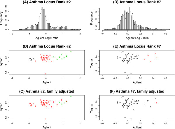
Figure 6.
Histograms and scatter plots for 2 asthma-associated CNV regions validated with qPCR. The histograms (panels A/D) are of all samples in the two asthma CNV regions. The scatter plots (panels B/C/E/F) are of the 46 samples with both Agilent array and qPCR measurements. (x-axis) represents the log2 ratios from CGH arrays and the y-axis represents the copy number estimates from qPCR. The scatter plots for unadjusted GMM (panels B/E) and family adjusted (panels C/F) are the same but colored differently indicating CNV calls (clusters).

