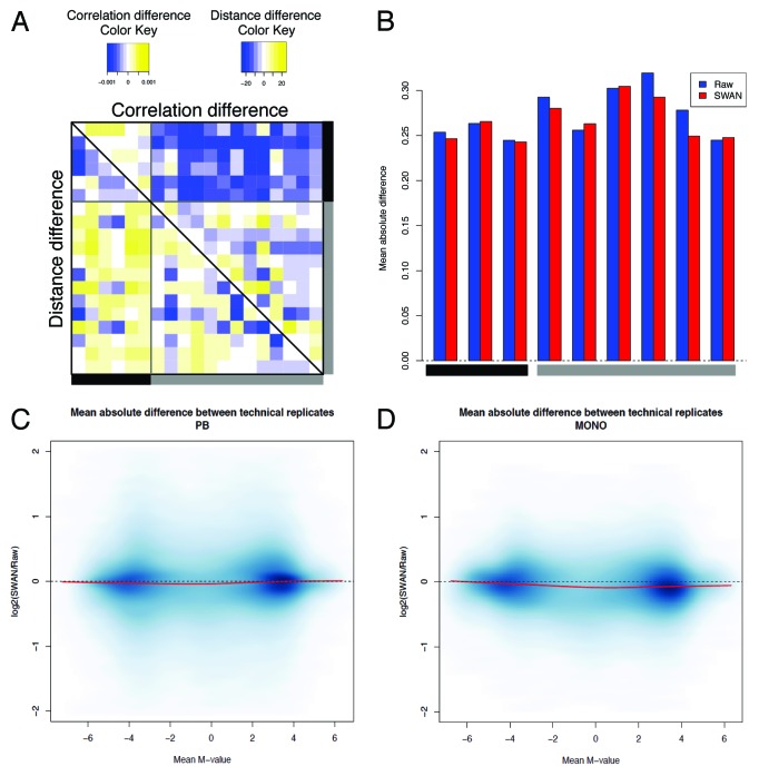
Figure 4. Evaluation of the minfi pipeline. (A) The difference in sample correlation (upper panel) or Euclidean distance (lower panel) between SWAN and raw data. For convenience, only samples represented by two or three technical replicates are shown. Color codes and positions of the samples are the same as Figure 2. (B) The absolute deviation between technical replicates in raw and SWAN-normalized data shows the reduction of the technical variability after normalization. (C and D) The logarithmic ratio between the variability after SWAN and the variability on raw data are shown for PB (C) and monocytes (D). For each probe, we calculated the average M-values and the corresponding mean absolute difference between technical replicates, as explained in Figure 2.

An official website of the United States government
Here's how you know
Official websites use .gov
A
.gov website belongs to an official
government organization in the United States.
Secure .gov websites use HTTPS
A lock (
) or https:// means you've safely
connected to the .gov website. Share sensitive
information only on official, secure websites.
