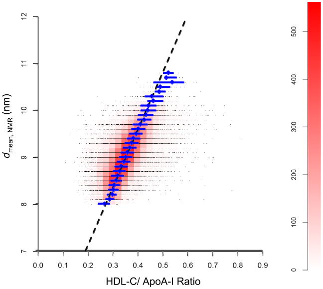
Fig. 1.
Scatter plot/heat map of the experimental relationship between the diameter of the HDL particles determined by NMR spectroscopy (davg, NMR) and the corresponding HDL-C/ApoA-I ratio from the WHS study (n=26,772). Data points (black dots) represent baseline values from individual subjects. Due to overlap of the points, these appear as black horizontal lines corresponding to the measured values of davg, NMR, e.g., 8.0, 8.1, 8.2, 8.3, etc. The color scale on the right vertical axis (heat map) indicates the number of data points within the unit rectangles (width 0.025; height 0.1 nm) that are adjacent to each other on each horizontal line. The pink/red “cigar shape” region corresponds to the highest density of data points in the WHS population. Blue diamonds represent the median HDL-C/ApoA-I ratio for data points with the same value of davg, NMR; horizontal blue line-segments represent the corresponding interquartile ranges. The dashed black line is based on a regression analysis of the HDL-C/ApoA-I ratios vs. the davg, NMR values. The equation is given by: davg, NMR = 4.66 + 12.31 HDL-C/ApoA-I. See Experimental Methods (Statistical Analysis of WHS Data) for details.

