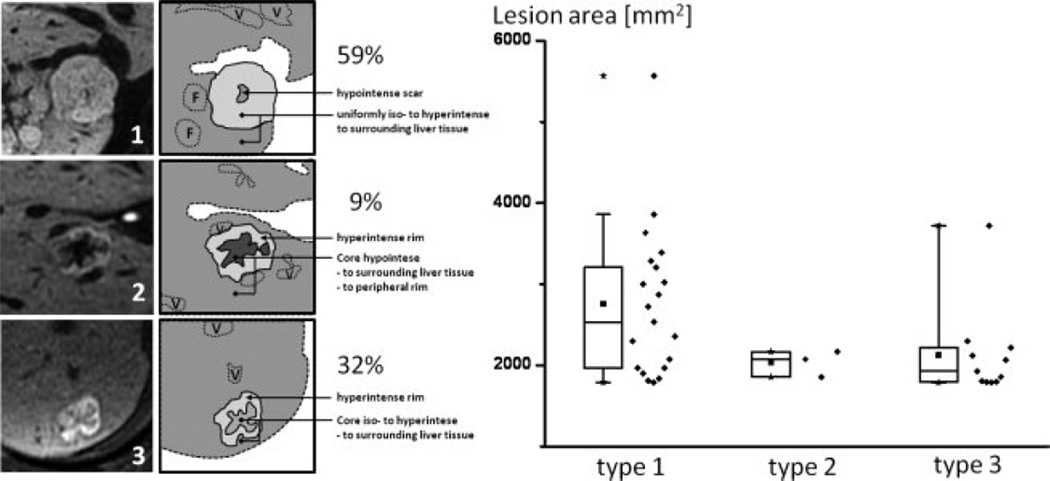
Figure 7.
Left: Schematic representation of the three observed FNH patterns (1, 2, 3). F = additional FNH’s; V = vessel. Right: Box plots show the distribution of enhancement pattern types in comparison to approximate lesion area on the image with largest lesion diameters (mm2). No correlation of enhancement pattern type and maximum size was seen, although the larger lesions tended to demonstrate type 1 delayed enhancement. For detailed statistics, please refer to Results section. Solid cube = median, stars = minimum and maximum value; diamonds next to box plots show the data distribution.

