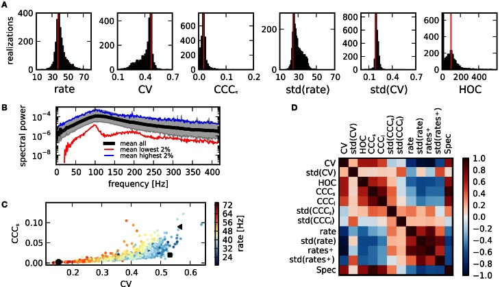
Figure 3.
Activity measures. (A) Distribution of key statistical measures for activity across networks demonstrates the variety of realized activity patterns. Vertical red lines indicate corresponding values for a sample random network. (B) Power spectrum of population activity is similar across realizations. Black: Average across all networks. Shaded region shows sample average ± relative error calculated from standard deviation. Blue: Average across 2% of all networks with highest integrated power spectrum. Red: Average across 2% of networks with lowest integrated power spectrum. (C) Scatter plot of CV as a measure of spike train irregularity and CCCs, which quantifies the average pairwise correlation, for all networks. Colors indicate mean rate. Black symbols correspond with examples shown in Figure 1. The variations of these features are strongly correlated. (D) The matrix of correlations between all activity characteristics, computed for the sample of networks considered in this study, reveals the various dependencies between statistical measures.

