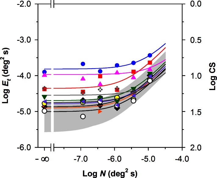
Figure 4. .
Log Et as a function of log N for the 10 patients with RP compared with the normal range for the 10 control subjects (gray region). The log CS equivalents of the log Et values are given on the right y-axis. The curves represent the least-squares best fits of Equation 2 to the data of each patient with RP, with symbols corresponding to those shown in the Table.

