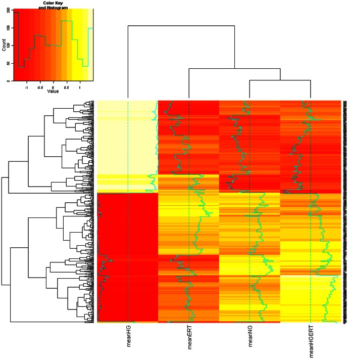
Figure 6. Heat map of transcriptomic analysis.
Heat map reflecting the mean gene expression values in the four different treatment groups: From left to right: high glucose (HG, 30 mM), normal glucose and 5 mM erythritol (NGERT), normal glucose (NG), high glucose and 5 mM erythritol (HGERT). Cluster analysis shows that the expression profile in the HG group differs from the other three treatment group that form a separate cluster.

