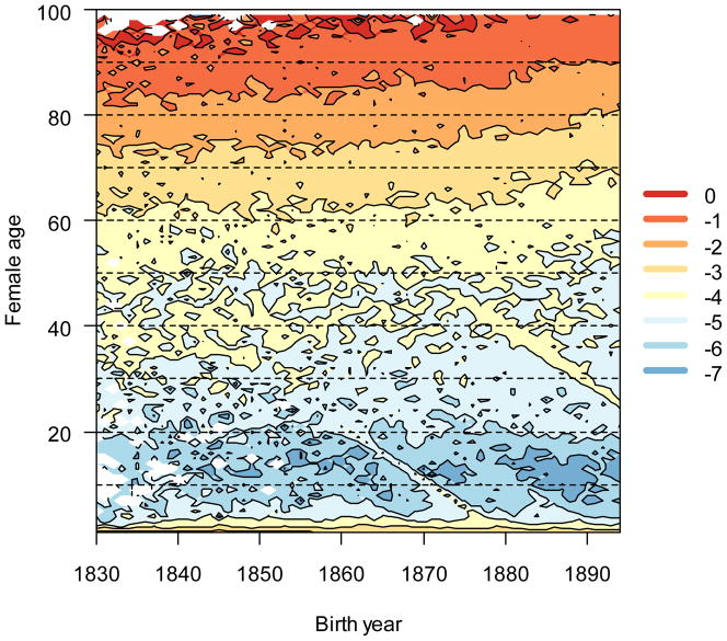
Figure 1.
Age-specific (log-scaled) mortality decreased over time. Dark shades (warm colors online) indicate low mortality rates, and light shades (cool colors) indicate high mortality rates. Reductions in age-specific mortality with time (a mortality transition) are visualized as isoclines that increase simultaneously along the x (birth year) and y (age) axes. White values represent ages where no deaths occurred (no mortality). Ridges that run diagonally down and to the right indicate brief (one to two years) periods of elevated mortality that is somewhat age-independent.

