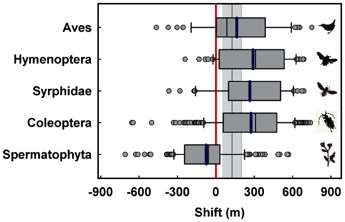
Figure 3. Mean shift of the upper range margin of species.
Box plots of shifts in the upper ranges of single species of the lineages under study between 1902–1904 and 2006–2007. Each outlier is shown (outside the 10th and 90th percentiles). The mean shift of each lineage is indicated by a blue line. The black line indicates the mean expected shift of 125 m; the area shaded in grey represents the range of the expected shift of 51–201 m. Calculations are based on regional climate data (for detail, see Statistical methods).

