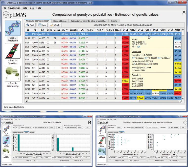
Figure 1.
OptiMAS graphical interface showing the three different steps of the selection process. (A) Prediction of global scores (MS, Weight, UC) and genotype probabilities at QTL (with detailed view for one cell). (B) Selection (comparison between two lists of selected individuals). Graphs display the distribution of the molecular scores (here for QTL1). (C) Intermating (comparison of two mating schemes). Individuals are ranked on the two axes based on their genetic value (MS from highest to lowest). Left side graph displays the outcome of the better-half procedure illustrating that crosses between individuals having lowest MS have been avoided (i.e., B37 to B125). Right side graph illustrates the outcome of selection of the “best” crosses based on the UC considering constraints (here each candidate can contribute only twice).

