
Figure 8.
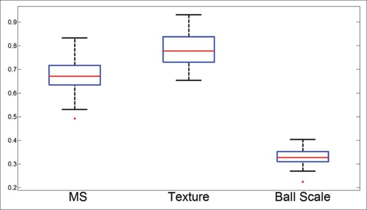
Box plots for the true positives across 50 runs from all 3 algorithms. The red line identifies the mean, the blue box encompasses 25th percentile, with the black whiskers extending to the 75th percentile. Red dots are indicative of outliers