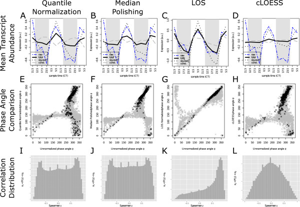
Figure 2.
Normalization changes phase angles and expression correlation. Systematic comparison of important properties of the expression profile set after normalization with different methods. Columns one to four correspond to the methods quantile normalization, median polishing, LOS, and cLOESS, respectively. Rows one to three correspond to plots of prominent average expression profiles, expression phase comparisons, and pairwise correlation distributions. The mean expression profiles for different gene groups illustrate the impact of normalization methods. A comparison of the unnormalized mean expression profile of all genes (dashed blue) with the normalized mean over all genes (black solid), significantly oscillating genes (posc < 0.05 in unnormalized data - black dotted) and not oscillating genes (posc > 0.05 in unnormalized data - gray dashed) is shown in panel A to D. The time of maximal expression in oscillatory profiles, measured using the Fourier transformation, is frequently altered by the normalization method. Panel E to H show the comparison between expression phases observed in the unnormalized (x-axis) versus normalized (y-axis) data. Profiles with significantly oscillating expression (posc < 0.05) are shown in black, whereas weak or non-oscillators are shown in gray (posc > 0.05). The histogram of pairwise Spearman correlation coefficients between expression profiles as proxy of the diversity of the global expression landscape is shown in panels I to L.

