
Figure.
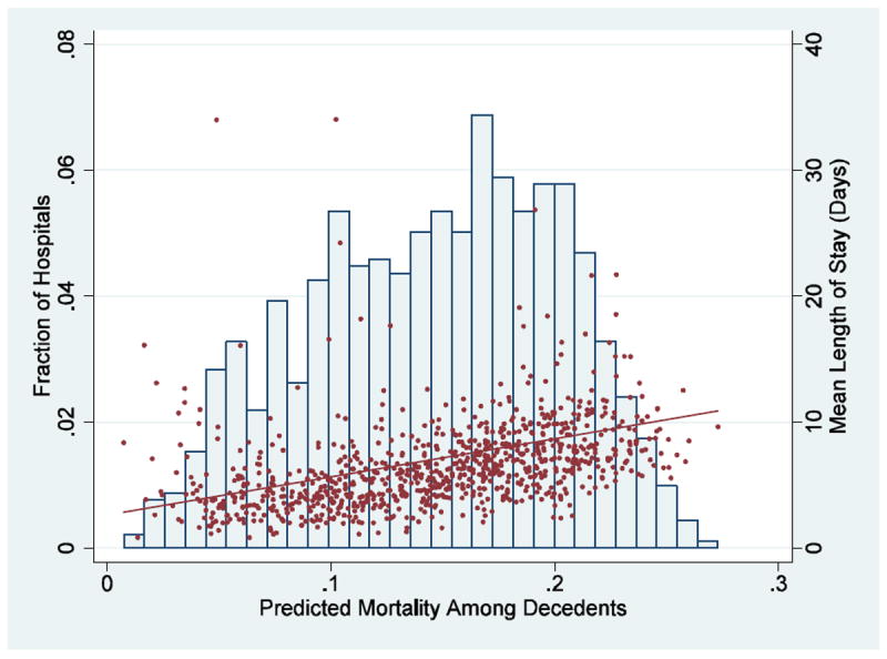
Distribution among Hospitals of the Average Predicted Risk of Death at Admission among Patients 65 Years of Age or Older Who Died
The histogram, graphed on the left axis, shows the distribution of the average predicted risk of death at admission in various hospitals among patients 65 years of age or older who died. The average length of stay for these individuals in each of those hospitals (red dots) and the linear relation (red line) between average predicted risk of death in the hospital and the average length of stay for those decedents are shown on the right axis. The linear relation between severity of illness and length of stay is highly statistically significant (P< 0.001). Data are from the 2006 Nationwide Inpatient Sample.