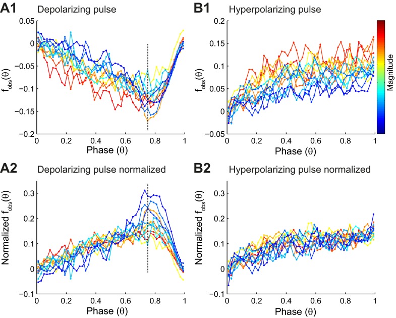
Fig. 4.
Summary of PRC data. A1: the binned averaged data (filled circles) for PRCs, measured in 12 different neurons in response to depolarizing pulse, are color coded for PRC magnitude, with red representing the strongest resetting. A2: PRCs normalized by the maximum resetting for each curve to illustrate that the shape is consistent prior to reaching the causal limit. Points to the right of the vertical, dashed line are influenced largely by the proximity of the causal limit. Note that normalization reverses the sign and facilitates comparison with PRCs measured in response to hyperpolarization in B2. B1: the binned averaged data as in A1 for PRCs measured in response to hyperpolarization (n = 14). B2: PRCs normalized by the maximum resetting for each curve. The shape is noisy but consistent across magnitudes.

