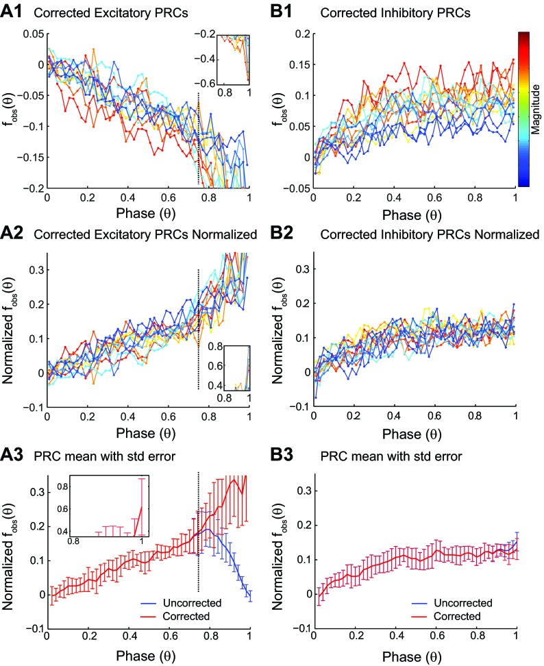
Fig. 5.
Effects of bias in PRC data. A1: the bias-corrected binned averaged data (filled circles) for PRCs, measured in 12 different neurons in response to depolarizing pulse, are color coded for PRC magnitude, with red representing the strongest resetting. The inset shows the presumably unreliable mean estimation from the residual remaining, severely truncated tail. A2: PRCs normalized by the maximum resetting for each curve to illustrate that the shape is consistent prior to reaching the causal limit, where the inset again shows the large fluctuations near the causal-limit region. Note that normalization reverses the sign and facilitates comparison with PRCs measured in response to hyperpolarization in B2. A3: SE (std error) for the corrected (but not the uncorrected curve) increases dramatically to the right of the dashed line, indicating the predominance of the causal-limit region. B1: the bias-corrected binned averaged data as in A1 for PRCs measured in response to hyperpolarization. B2: PRCs normalized by the maximum resetting for each curve. The shape is noisy but consistent across magnitudes. B3: no increase in SE is observed for the corrected vs. uncorrected version.

