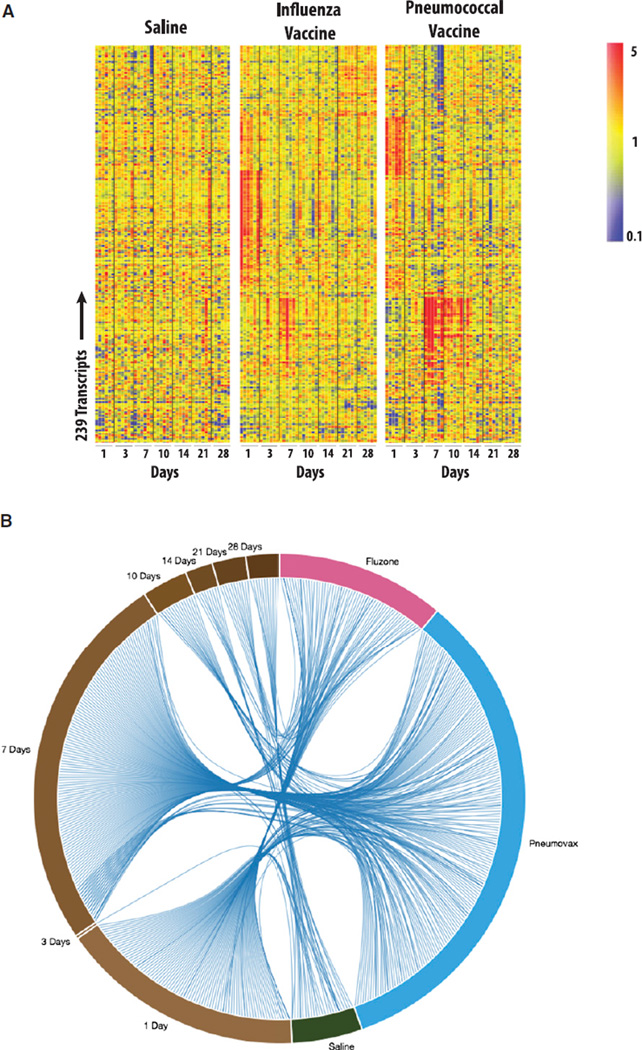
Figure 1. Blood Transcriptional Profiles of Vaccinated Subjects.
(A) Patterns of changes in transcript abundance are shown on a heatmap for a robust set of 239 transcripts using an FDR of 0.10 and fold change >2). For each subject, data are normalized to the average of the two baseline time points. Red represents relative increase in abundance, blue represents relative decrease, and yellow represents no change.
(B) Lists of genes differentially expressed in response to each treatment for all time points or at each time point for all treatments are represented as segments on a circle. The length of the segments is proportional to the number of genes in each list. A link between two segments on this circular plot indicates an overlap between two gene lists between treatments (segments on the right) and time points (segments on the left). An interactive supplement is available for this figure that dynamically highlights how shared genes of one segment are distributed across all other segments and displays symbols for the corresponding genes (iFigure 1B: http://www.interactivefigures.com/dm3/circleChart/arcCirclePlot). It also provides the user with the ability to dynamically add a cutoff based on fold-change expression over baseline and to adjust the aspect of the graph. For study design, see Figure S2 and Table S1, Table S2, and Table S5; for comparison of transcriptional profiles across cohorts, see Figure S3.

