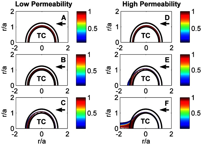
Figure 8. Evolution of thrombin concentration for low ( ) and high (
 ) permeable fibrin networks in time: 0 s (A, D), 13 ms (B, E), 38 ms (C, F).
‘TC’ denotes a thrombus core. The arrow shows the direction of flow. The flow Reynolds number,  . The color bar shows thrombin concentration relative to its initial value when thrombin is uniformly distributed in a 2
  m thick layer near the thrombus core (
 = 0 s).

