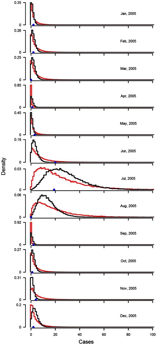
Figure 2. Posterior predictive distributions for the last 12 months of the Gampaha malaria case count series.
In each panel, representing each a month in the last year of the series, the black and the red lines are the outline histogram of the density of the posterior predictive distribution of the negative binomial  model and a (Bayesian) Gaussian
  model on Box-Cox transformed data, respectively. Models were fitted to the entire data set. In each panel, the observed case count is represented by a blue dot.

