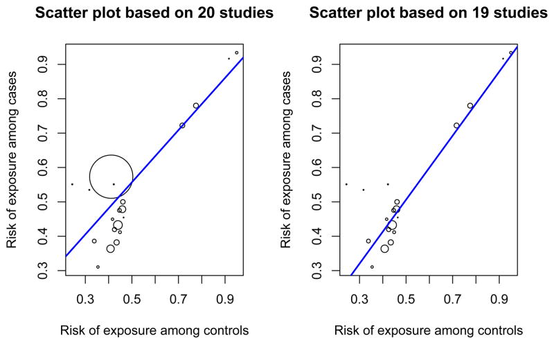
Figure 4.
Scatter plot of risks of exposure among cases and controls for Ye and Parry21 dataset. The area of each circle is proportional to the total sample size of the study. A regression line is overlaid with coefficients estimated by weighted least squared (weights proportional to the total sample size of the study). Left: scatter plot based on all twenty studies. Right: scatter plot based on dataset with the largest study removed.

