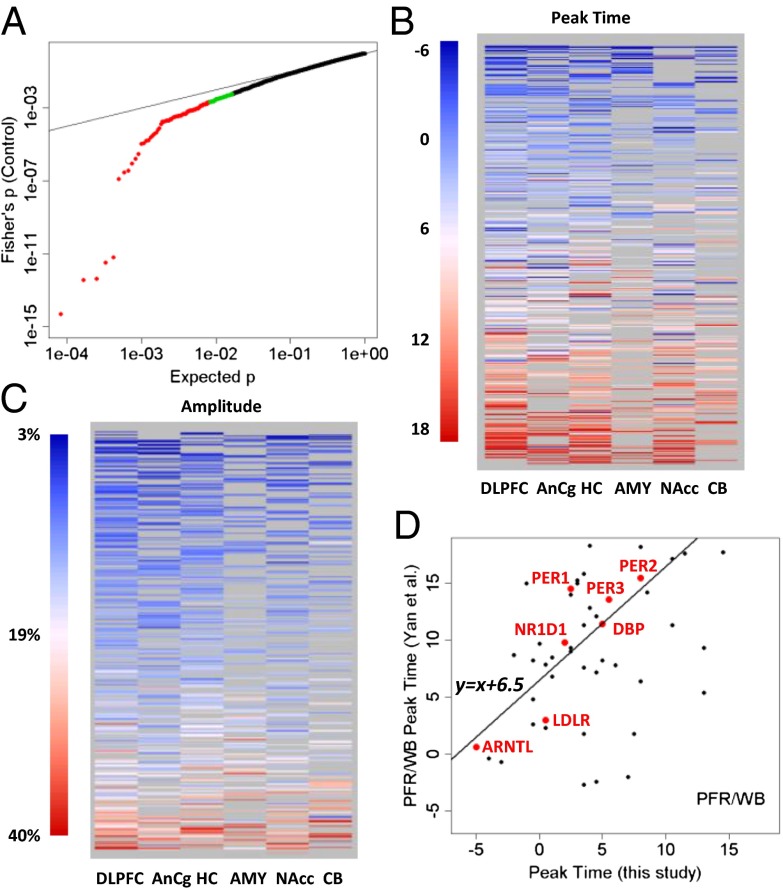
Fig. 3.
Top cyclic genes show consistent rhythmicity, phasing, and amplitude across brain regions. (A) More than 100 genes exhibit consistently significant rhythmicity. The quantile–quantile plot compares the distribution of the combined P values across the six brain regions (using Fisher’s method) and a uniform distribution, showing that 100–200 genes had smaller combined P values than expected. The top 100 genes were colored in red, and the next 100 genes were colored in green. Gray lines indicate the sorted original P values in the six individual brain regions. The dotted red line indicates uniformly distributed P values. (B) Phasing of the top cyclic genes is consistent across brain regions, as indicated by a heat map of peak times. Genes are ordered from top to bottom by mean peak time. Genes of nonsignificant (P > 0.1) cyclic patterns in a given region were shown as missing (gray) because their peak times could not be accurately determined. (C) Amplitude of rhythms is similarly consistent across brain regions, as indicated by a heat map of the amplitude for 445 transcripts with P < 0.05 in at least two of six regions. Genes are ordered from top to bottom by mean amplitude. (D) Phasing of the top cyclic genes differs between species with different chronotypes (day-active human vs. night-active mouse). Shown is a comparison of peak times for genes that overlapped between a metaanalysis of circadian gene expression in the mouse (5) and our study (P < 0.01 in controls). The y axis shows the peak time in the mouse prefrontal cortex (PFR) or whole brain (WB). The line in the plot models a linear relationship using the 7 top genes (highlighted in red). When fit with robust linear modeling, they revealed a shift of 6.51 h and a slope of 1.18 (r = 0.88).

