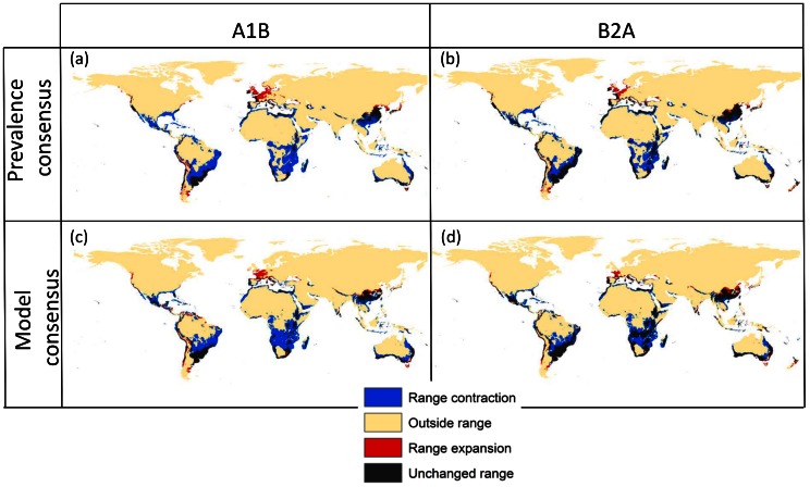
Figure 1. Potential range of Tetranychus evansi.
Maps reflect median of predictions from model outputs, comparing current and future climate from two different climate change scenarios. On the left side, scenario A1B, on the right side the more conservative B2A scenario (see text for description of scenarios). The upper row shows results from consensus between GAM models with different prevalence levels (10%, 30%, 50%, 70%, 90%), whereas the lower row shows consensus between four different modelling strategies (GAM, BRT, CART, MAXENT) at a prevalence of 50%. Black areas indicate regions that are predicted as part of the potential range under current and future conditions; blue areas correspond to areas that are today part of the potential range but that are predicted to become outside the range under climate change conditions in 2080 (range contraction); red areas indicate potential range expansions meaning they become part of the potential range under climate change scenarios; finally yellow areas are not part of the potential range.

