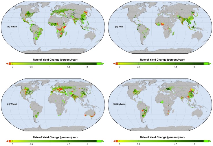
Figure 2. Maps of observed rates of percent yield changes per year.
Global map of current percentage rates of changes in (a) maize, (b) rice, (c) wheat, and (d) soybean yields. Red areas show where yields are declining whereas the fluorescent green areas show where rates of yield increase – if sustained – would double production by 2050.

