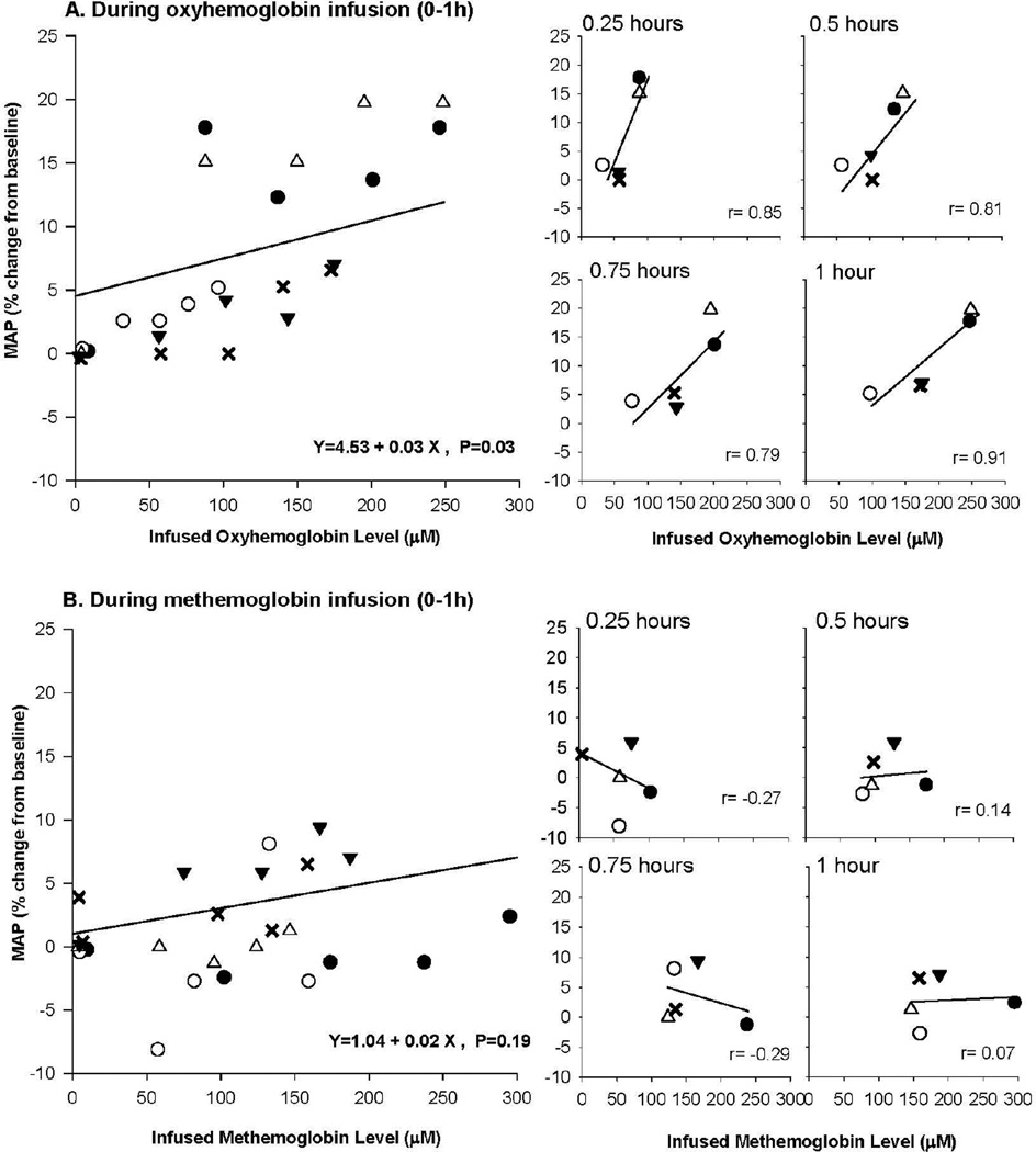
Figure 4. Comparison of percent change in MAP and infused oxyHb plasma levels.
The top four panels labeled A on the left shows the association of MAP and oxyHb levels during infusion 0 to 1 h. Each of the 5 animals is depicted by a different symbol (open circle, open triangle, closed circle, inverted closed triangle, and X), and the regression line was estimated using a mixed model. On the top panel to the right are shown at serial time points in animals during the oxyHb infusion, the correlation between MAP and plasma oxyHb levels. (The symbols are the same for each animal, as in the figure to the left.) The bottom panels labeled 5B are similar in format to the 5A top panels, except now infused metHb levels are shown from 0 to 1 h.

