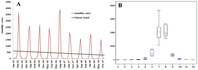
Figure 1. Temporal distribution patterns of JE cases in mainland China.

(A) The figure shows epidemic curve of monthly JE cases from 2002–2010; (B) The seasonal epidemic patterns of JE distribution. The bottom and top of the box indicates the lower quartile (P25) and the upper quartile (P75) respectively; the line in the middle of the box represents the median value; the bottom and top line is minimum and maximum respectively.
