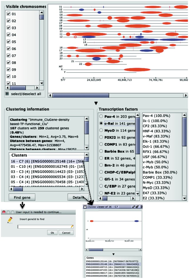
Figure 2. An example of cluster analysis session within CluGene, based on sequential gene processing, functional distance metric and a weighting function combining local density and TF similarity.
Clusters are visualized as oval-shapes calculated on the different chromosomes; information concerning the number of clusters and the number of clustered genes is also provided, along with the minimum, average and maximum number of genes present in the clusters, and the minimum, average and maximum distance (bp) between clustered genes and clusters. Detailed information of the distribution of cluster sizes is provided as well. For each cluster, it is possible to visualize the number of contained genes, together with their location and the list of TFs with their associated frequencies. Besides, it is possible to visualize, for entire clustered dataset, the calculated TFs together with associated frequencies. For each TF it is possible to identify the number of recognized target genes and the relative number of clusters. Once a TF is selected, the clusters positive for the specified TF are interactively highlighted in red whereas negative clusters remain blue (default colour).

