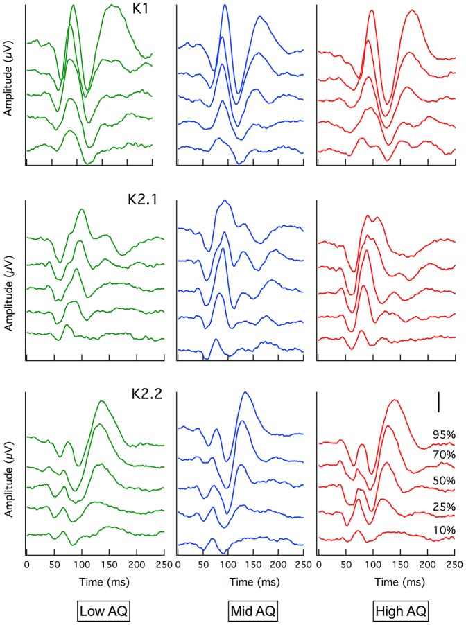
Figure 1. Grand mean average VEP.
Waveforms are shown for Low (green), Mid (blue) and High AQ (red) for K1, K2.1 and K2.2 kernels. Separate traces represent evoked potentials to different temporal luminance contrast from 10% (bottom trace) to 95% (top trace). Larger amplitudes with steeper gradients can clearly be seen in the K2.1 waveform for the High AQ group compared with Low AQ. Note: Scale bar = 500 nV

