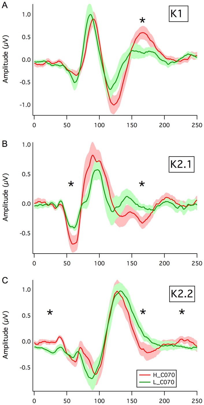
Figure 3. Waveform Comparison.

Comparison of the grand mean average waveforms for a: K1, b: K2.1 and c: K2.2 kernel responses recorded at 70% stimulus contrast. The mean waves for the High and Low AQ groups are shown with a fringe of ±1SE. Significant mean waveform departures (p<.05) are indicated by asterisks.
