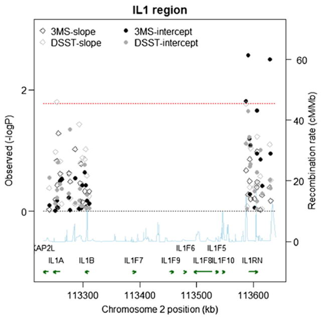
Fig. 2.

Single SNP Associations (−log10(pvalue)) by Position for 3MS and DSST scores in the White Cohort (n=3575). Chromosome position is shown in kilobases (kb). Genes annotations are shown on the bottom of the figure, where the direction of the arrow shows the 5′ to 3′ direction of transcription. Estimated recombination rates in centiMorgan per Megabase (cM/Mb) are obtained from HapMap data and are plotted directly above the genes to reflect the linkage disequilibrium structure. Position, annotations and estimated recombination rates use Build 36 coordinates. P-values are plotted as –log 10 values (−logP). Dashed lines are shown at values that correspond to a zero p-value and a p-value of 0.016. Solid symbols represent p-values from the fixed effect for the baseline term and open symbols represent p-values from the fixed effect for the slope term; symbols relating to the 3MS are in black, and symbols relating to the DSST are in gray. Software to create the figure is adapted from the R script provided for the Regional Association Plot on the Broad Institute website (http://www.broadinstitute.org/science/projects/diabetes-genetics-initiative/plotting-genome-wide-association-results).
