
Figure 6.
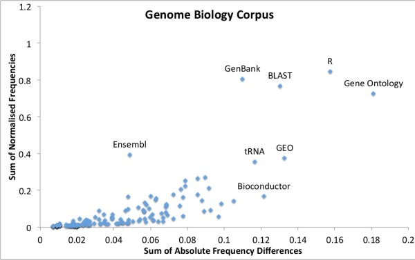
Genome Biology’s variation in top 50 resource usage. The sum of normalised frequencies against the sum of absolute differences for Genome Biology’s top 50 resource mentions with interesting outliers labelled. The y axis highlights the relative level of use of a resource, whereas the x axis shows the level of variation of tool use across the years 2000 to 2011.