
Figure 2. Heat map of LOD scores.
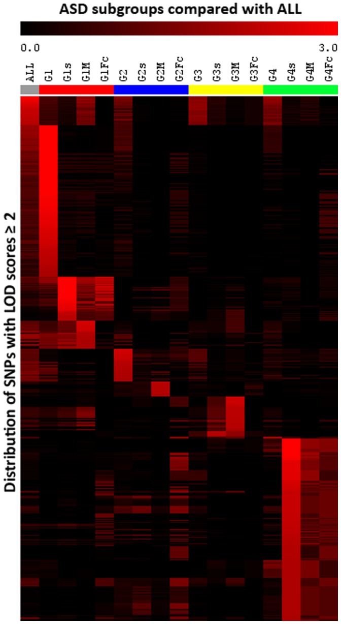
A graphical representation (heat map) of the LOD score data (cut-off ≥2.0) was generated to visually demonstrate the computed linkage scores for each subgroup in a hierarchy. The heat map compares LOD score patterns for the 16 subgroups. As expected, there were more similarities within each ADI-R group (e.g., G1, G1s, G1M, and G1Fc) than between two different ADI-R groups. Each horizontal band represents a SNP while each column represents a stratified subgroup, with the exception of the first column which represents the combined (ALL) cohort. Table S4 in File S2 lists the SNPs and LOD scores contributing to the identified segregation patterns by subgroups (i.e., hot spots). The corresponding genomic positions of the SNPs contributed to the heat map (Y-axis) are listed in Table S4 in File S2. The heat map was generated using MeV software [41].